Frequency Analysis
Frequency tables are tables that display information about the number of instances data values appear within a dataset. Frequency tables in SPSS display the Frequency (number of instances), Percent (the frequency relative to total sample size), and Cumulative Percent (summation of the percents going down the table) of each data value.
This example will generate a frequency table for the respondents' astrological signs, the 'zodiac' variable.
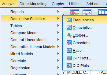
To generate a frequency table, click on 'Analyze' in the toolbar at the top of the Data Editor window. Then, click 'Descriptive Statistics' in the dropdown menu and 'Frequencies...' in the side menu.
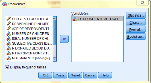
In the Frequencies dialog box that pops up, double click on the variable of interest (Age of Respondents) in the variable list to add it to the 'Variable(s):' field. Then, click 'Statistics...' and in the dialog box that pops up, check off any desired statistics that you would like to appear in the output. Then, click 'Continue.' Back in the Frequencies dialog box, click OK, and the frequency table will be displayed in a table in the SPSS Viewer output window.
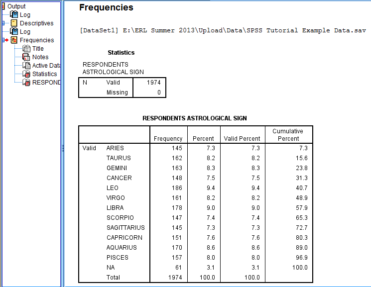
In the SPSS Viewer window, the output is displayed. The Statistics table displays the N and any statistics requested in the Statistics dialog box. The Respondents Astrological Sign table displays the frequency information. For example, 145 respondents, 7.3% of all respondents, have the zodiac sign Aries.
Frequency Charts are charts that graphically display information about the frequency of data values, such as the number of instances data values appear within a dataset. This portion of the tutorial include instructions for how to make charts forcategorical variables (bar charts and pie charts) and continuous variables (histograms, line charts, and boxplots). Additionally, it includes instructions for how to make a chart of means that displays the relationship between two variables. Lastly, this portion of the tutorial also includes information about saving and applying chart templates.
Please note: this section of the tutorial alternates between using the Chart Builder or the Legacy Dialogs from the Graphs dropdown menu to make charts because each offers unique options.
Charts for Categorical Variables
Categorical variables are variables that represent continuous data that is categorized by groups. For example, the data for each respondent's zodiac symbol are categorical because the data values are grouped into categories, corresponding to the zodiac symbols. Data for categorical variables can be represented in bar charts and pie charts.
Bar Charts
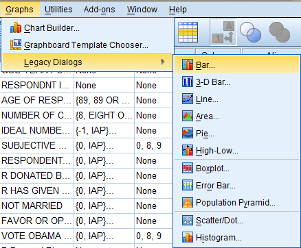
To generate a bar chart, click on 'Graphs' in the toolbar at the top of the Data Editor window. Then, click 'Legacy Dialogs' in the dropdown menu and 'Bar...' in the side menu.
In the Bar Charts dialog box that pops up, select the 'Simple' icon and 'Summaries for groups of cases' option. Then, click 'Define.'
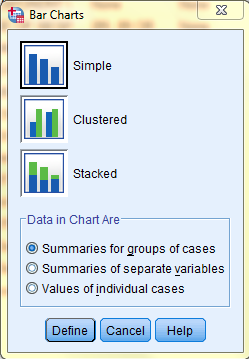
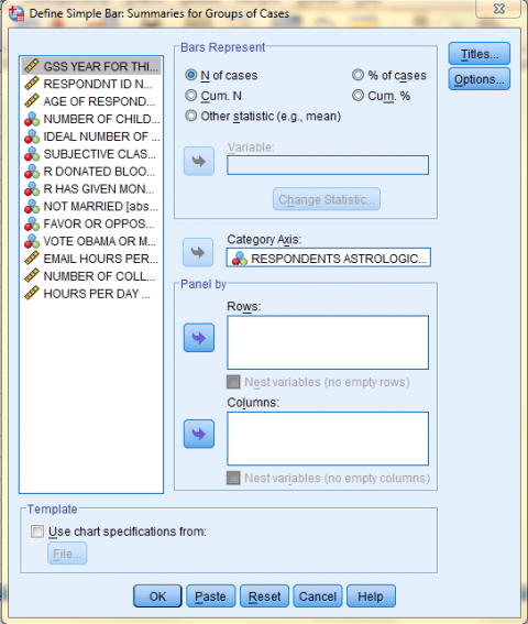
In the Define Simple Bar: Summaries for Groups of Cases dialog box that pops up, click on the variable of interest (Respondents Astrological Sign) in the variable list to add it to the 'Category Axis:' field. In the 'Bars Represent' field, select the information you would like the bars to display. Here, we selected 'N of cases' because we want the bars to represent the number of respondents with each zodiac sign. Then, if you would like to add a title to your chart, click 'Titles...'
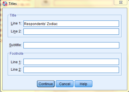
In the Titles dialog box that pops up, type in your desired title. Then, click 'Continue.'
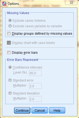
Back in the Define Simple Bar: Summaries for Groups of Cases dialog box, click 'Options' if you would like to change any other chart settings or add error bars. The following image displays the Options dialog box. Lastly, click 'Continue' to exit the Options dialog box, and click 'OK' in the Define Simple Bar: Summaries for Groups of Cases dialog box to create the chart.
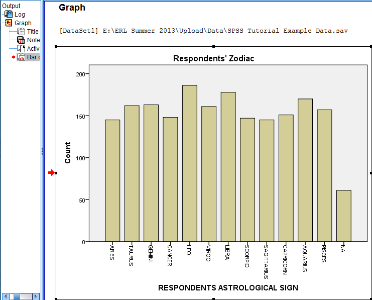
In the SPSS Viewer window, the output is displayed. Double click on the chart to bring up the Chart Editor window to edit the chart, make it more visually appealing, and easier to interpret.
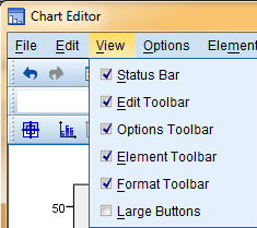
In the Chart Editor window, make sure all toolbars and options are visible by clicking 'View' in the top toolbar and seelcting all toolbars.
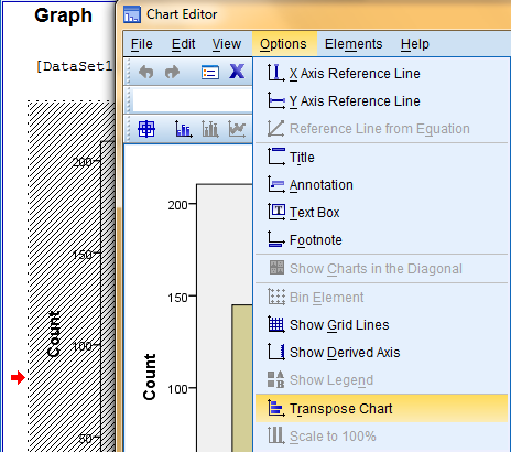
Next, we will make the chart more visually appealing by transposing the chart, switching the axes. To transpose the chart, click on 'Options' in the top toolbar of the Chart Editor window, and then click on 'Transpose Chart.'
Another way to transpose the chart is by clicking on the 'Transpose chart coordinate system' icon in the options toolbar.
![]()
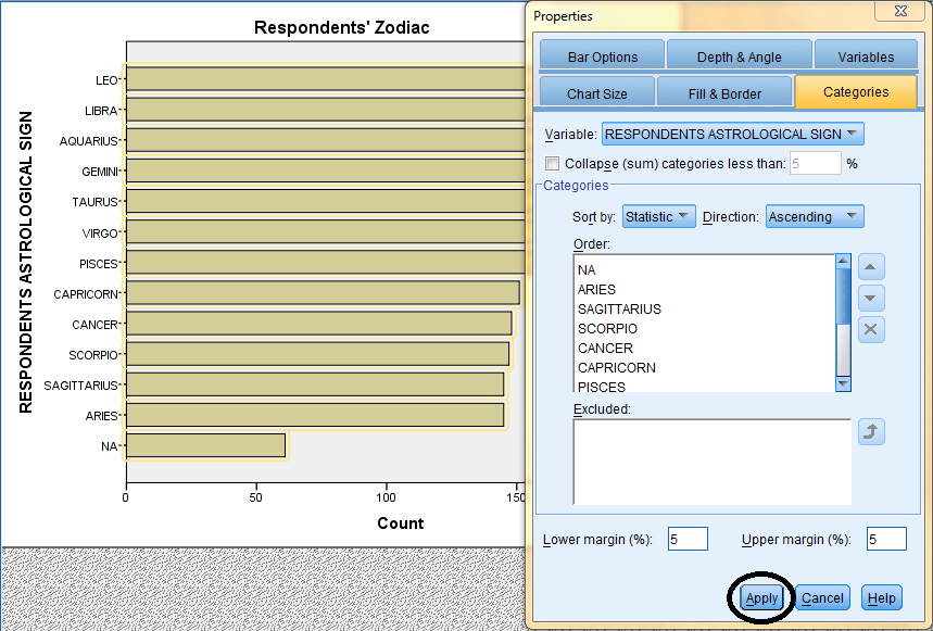
To sort the bars in ascending order and make the chart easier to interpret, double click on the bars to bring up the Properties dialog box. Then, in the Categories tab, select the desired sort order in the 'Sort by' and 'Direction' fields, and click 'Apply.' Please note: the changes you make in the Properties dialog box will not be reflected in the chart in the Chart Editor window until you click on Apply. Furthermore, the changes applied in the Chart Editor window will not be reflected in the chart in the SPSS Viewer output window until the Chart Editor window is closed.
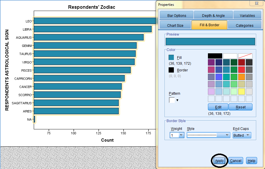
If you woud like to change the bar fill color, double click on the bars to bring up the Properties dialog box. Then, in the Fill & Border tab, select the desired fill color, and click 'Apply.' Please note: the changes you make in the Properties dialog box will not be reflected in the chart in the Chart Editor window until you click on Apply. Furthermore, the changes applied in the Chart Editor window will not be reflected in the chart in the SPSS Viewer output window until the Chart Editor window is closed.
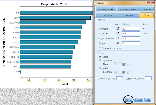
If you woud like to change the scale of the axes, double click on the specific axis you would like to change to bring up the Properties dialog box. Then, in the Scale tab, enter the desired Minimum, Maximum, Major Increment, and Origin values, and click 'Apply.' Please note: the changes you make in the Properties dialog box will not be reflected in the chart in the Chart Editor window until you click on Apply. Furthermore, the changes applied in the Chart Editor window will not be reflected in the chart in the SPSS Viewer output window until the Chart Editor window is closed.
Pie Charts
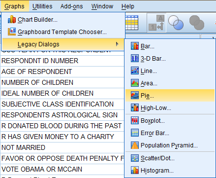
To generate a pie chart, click on 'Graphs' in the toolbar at the top of the Data Editor window (specifically in the Data View). Then, click 'Legacy Dialogs' in the dropdown menu and 'Pie...' in the side menu.
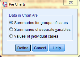
In the Pie Charts dialog box that pops up, select the 'Summaries for groups of cases' option. Then, click 'Define.'
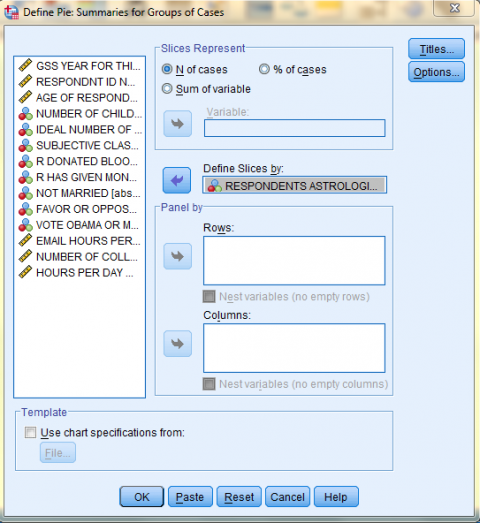
In the Define Pie: Summaries for Groups of Cases dialog box that pops up, click on the variable of interest (Respondents Astrological Sign) in the variable list to add it to the 'Define Slices by:' field. In the 'Slices Represent' field, select the information you would like the slices to display. Here, we selected '% of cases' because we want the slices to represent the % of the respondents that have each zodiac sign. Then, if you would like to add a title to your chart, click 'Titles...'
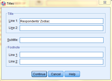
In the Titles dialog box that pops up, type in your desired title. Then, click 'Continue.'
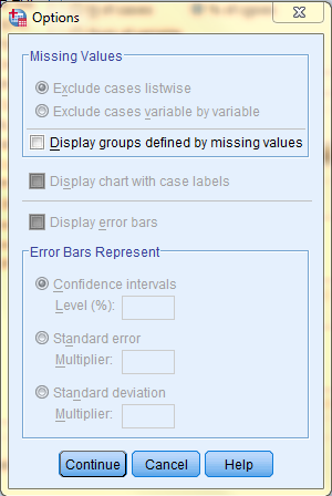
Back in the Define Pie: Summaries for Groups of Cases dialog box, click 'Options' if you would like to change any other chart settings. The following image displays the Options dialog box. Lastly, click 'Continue' to exit the Options dialog box, and click 'OK' in the Define Pie: Summaries for Groups of Cases dialog box to create the chart.
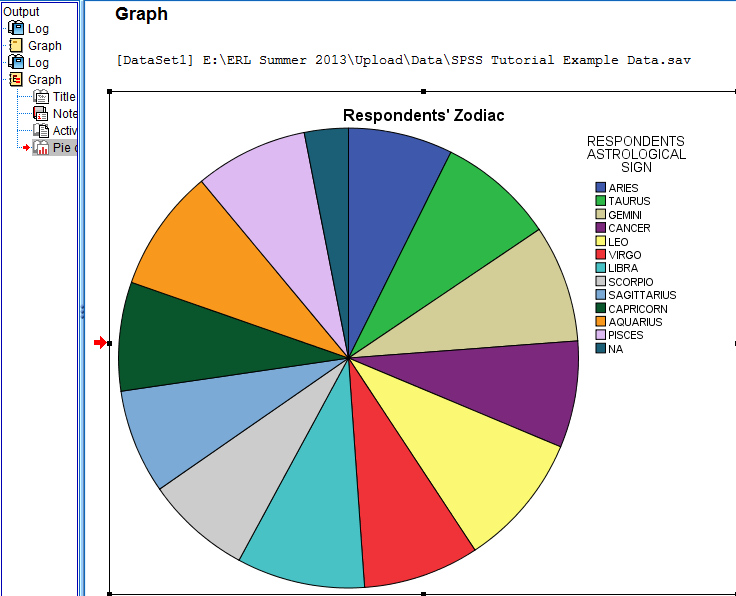
In the SPSS Viewer window, the output is displayed. Double click on the chart to bring up the Chart Editor window to edit the chart, make it more visually appealing, and easier to interpret.
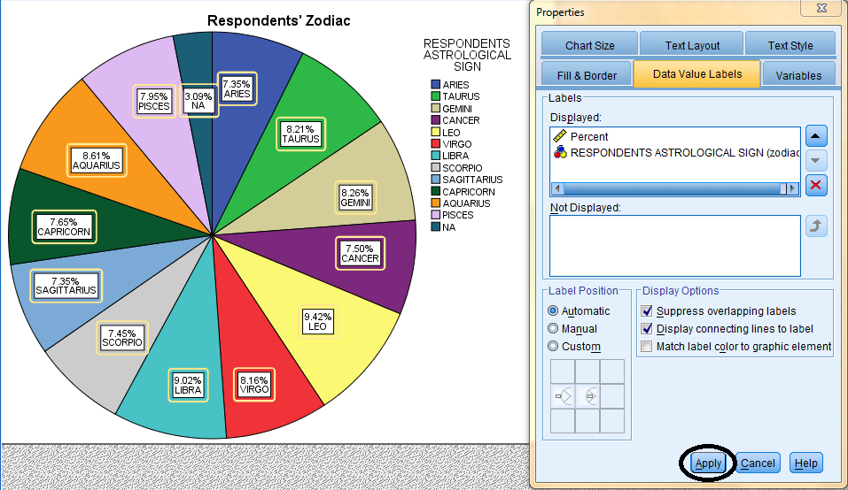
To label the slices in the chart and make the chart easier to interpret, click 'Elements' in the top toolbar of the Chart Editor window, and click 'Show Data Labels' in the dropdown menu.

Then, in the Properties dialog box that pops up, in the Data Value Labels tab, select Percent and the variable (Respondents Astrological Sign) and bring them from the Not Displayed field to the Displayed field. Then, click 'Apply.' Please note: the changes you make in the Properties dialog box will not be reflected in the chart in the Chart Editor window until you click on Apply. Furthermore, the changes applied in the Chart Editor window will not be reflected in the chart in the SPSS Viewer output window until the Chart Editor window is closed.
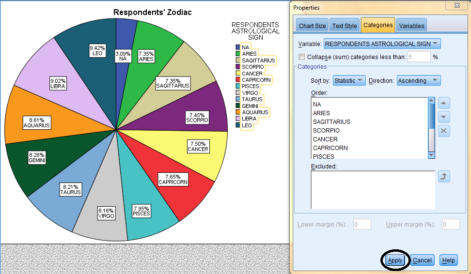
To sort the slices in the chart in ascending order and make the chart easier to interpret, double click on the slices to bring up the Properties dialog box. Then, in the Categories tab, select the desired sort order in the Sort by and Direction fields, and click 'Apply.' Please note: the changes you make in the Properties dialog box will not be reflected in the chart in the Chart Editor window until you click on Apply. Furthermore, the changes applied in the Chart Editor window will not be reflected in the chart in the SPSS Viewer output window until the Chart Editor window is closed.
Charts for Continuous Variables
Continuous variables are variables that, unlike finite discrete variables, can represent infinite numerical data within a range (such as between two points on a number line). For example, the data for each respondent's age is continuous. Data for continuous variables can be displayed on a continuum in histograms, line charts, and boxplots.
Histograms
Histograms are unique because they display continuous data in a meaningful way. Specifically, in a histogram, unlike a bar chart, the bars touch because the x-axis has a numerical meaning.
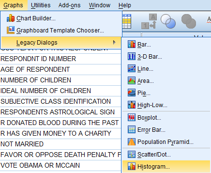
To generate a histogram, click on 'Graphs' in the toolbar at the top of the Data Editor window. Then, click 'Legacy Dialogs' in the dropdown menu and 'Histogram...' in the side menu.
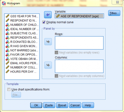
In the Histogram dialog box that pops up, click on the variable of interest (Age of Respondent) in the variable list to add it to the 'Variable' field. Make sure the 'Display normal curve' option is selected. Then, if you would like to add a title to your chart, click 'Titles...'

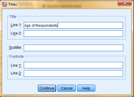
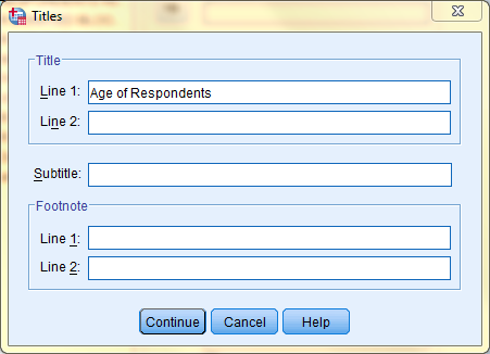
In the Titles dialog box that pops up, type in your desired title. Then, click 'Continue' and click 'OK' in the Histogram dialog box to create the chart.
In the SPSS Viewer window, the output is displayed. In addition to the histogram, the Mean, Standard Deviation, and Set Size are also and displayed to the right of the histogram. Double click on the chart to bring up the Chart Editor window to edit the chart, make it more visually appealing, and easier to interpret.
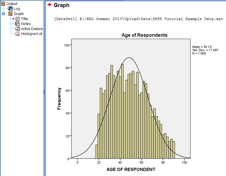
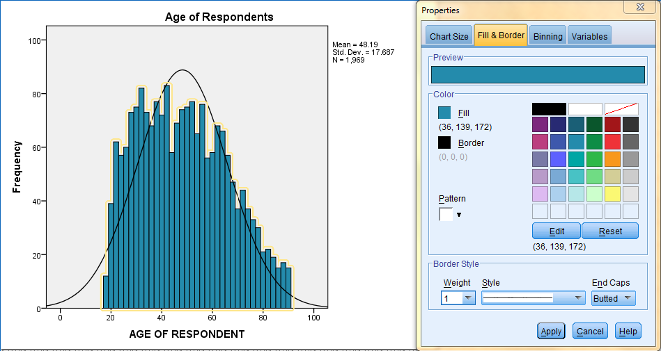
If you woud like to change the bar fill color, double click on the bars to bring up the Properties dialog box. Then, in the Fill & Border tab, select the desired fill color, and click 'Apply.' Please note: the changes you make in the Properties dialog box will not be reflected in the chart in the Chart Editor window until you click on Apply. Furthermore, the changes applied in the Chart Editor window will not be reflected in the chart in the SPSS Viewer output window until the Chart Editor window is closed.
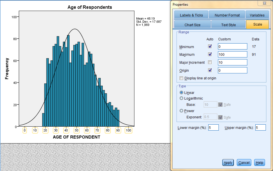
If you woud like to change the scale of the axes, double click on the specific axis you would like to change to bring up the Properties dialog box. Then, in the Scale tab, enter the desired Minimum, Maximum, Major Increment, and Origin values, and click 'Apply.' Please note: the changes you make in the Properties dialog box will not be reflected in the chart in the Chart Editor window until you click on Apply. Furthermore, the changes applied in the Chart Editor window will not be reflected in the chart in the SPSS Viewer output window until the Chart Editor window is closed.
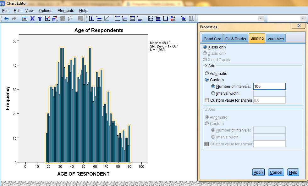
If you woud like to change the number of bins, double click on the bars to bring up the Properties dialog box. Then, in the Binning tab, enter the desired Custom Number of Intervals (100) and click 'Apply.' Please note: the changes you make in the Properties dialog box will not be reflected in the chart in the Chart Editor window until you click on Apply. Furthermore, the changes applied in the Chart Editor window will not be reflected in the chart in the SPSS Viewer output window until the Chart Editor window is closed.
Line Charts
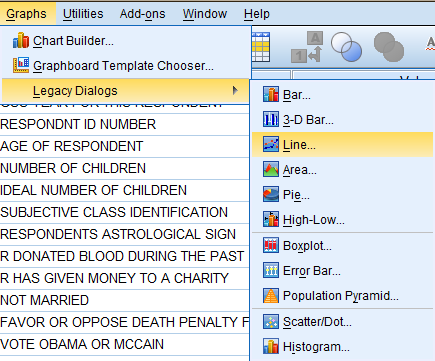
To generate a line chart, click on 'Graphs' in the toolbar at the top of the Data Editor window (s. Then, click 'Legacy Dialogs' in the dropdown menu and 'Line...' in the side menu.
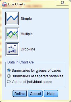
In the Line Charts dialog box that pops up, select the 'Simple' icon and 'Summaries for groups of cases' option. Then, click 'Define.'
In the Define Simple Line: Summaries for Groups of Cases dialog box that pops up, click on the variable of interest (Age of Respondent) in the variable list to add it to the 'Category Axis:' field. In the 'Lines Represents' field, select the information you would like the line to display. Here, we selected '% of cases' because we want the line to represent the % of respondents that are of each age. Then, if you would like to add a title to your chart, click 'Titles...'
In the Titles dialog box that pops up, type in your desired title. Then, click 'Continue.'
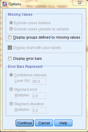
Back in the Define Simple Line: Summaries for Groups of Cases dialog box, click 'Options' if you would like to change any other chart settings or add error bars. The following image displays the Options dialog box. Lastly, click 'Continue' to exit the Options dialog box, and click 'OK' in the Define Simple Line: Summaries for Groups of Cases dialog box to create the chart.
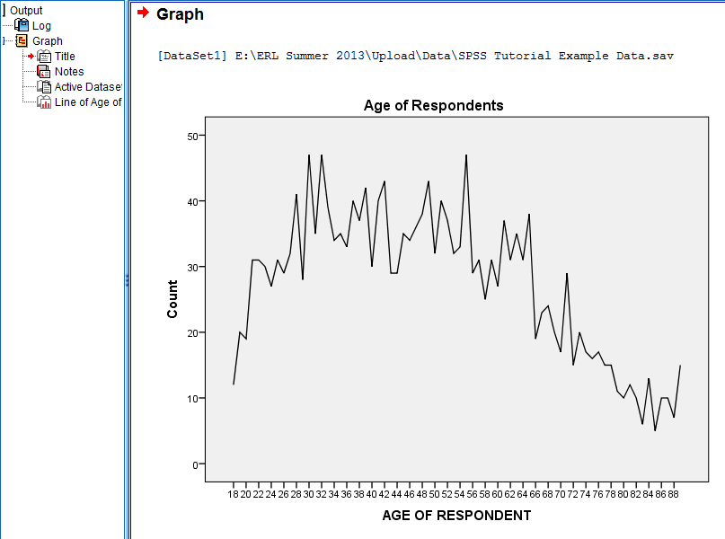
In the SPSS Viewer window, the output is displayed. Double click on the chart to bring up the Chart Editor window to edit the chart, make it more visually appealing, and easier to interpret.
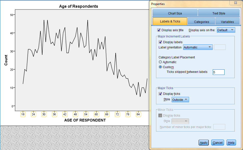
If you woud like to change the scale of the axes, double click on the specific axis you would like to change to bring up the Properties dialog box. Then, in the Labels & Ticks tab, in the Category Label Placement field, select Custom, and enter the number of ticks you would like skipped between each label. Then, click 'Apply.' Please note: the changes you make in the Properties dialog box will not be reflected in the chart in the Chart Editor window until you click on Apply. Furthermore, the changes applied in the Chart Editor window will not be reflected in the chart in the SPSS Viewer output window until the Chart Editor window is closed.
Boxplots
Boxplots are unique charts of quanitative variables because they are a visual presentation of the five point summary of a dataset (minimum, Q1, median, Q3, and maximum).
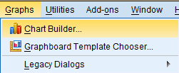
To generate a boxplot, click on 'Graphs' in the toolbar at the top of the Data Editor window. Then, click 'Chart Builder...' in the dropdown menu.
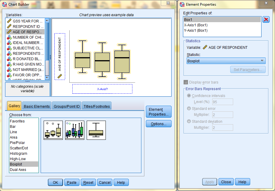
In the Chart Builder dialog box that pops up, select 'Boxplot' from the Gallery at the bottom left, and drag the leftmost, simple boxplot into the main Chart Builder preview interface. Then, drag the variable Age of Respondent from the 'Variables:' field to the 'Y-Axis?' box. Click 'OK.'
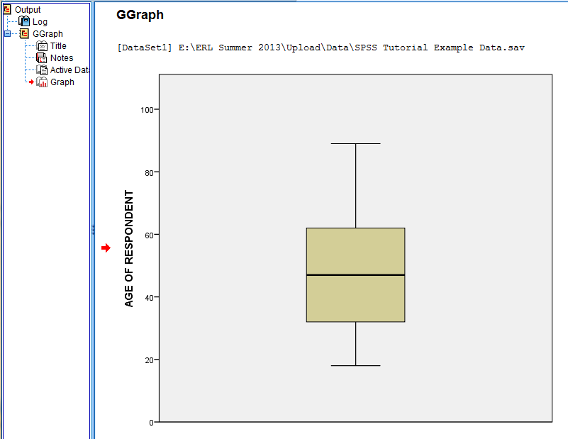
In the SPSS Viewer window, the output is displayed. Double click on the chart to bring up the Chart Editor window to edit the chart, make it more visually appealing, and easier to interpret.
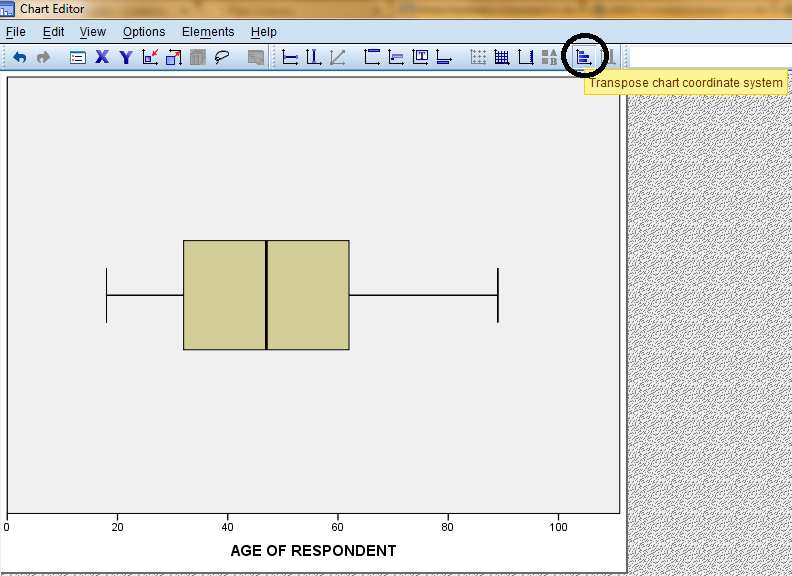
We will make the chart more visually appealing by transposing the chart, switching the axes, by clicking on the 'Transpose chart coordinate system' icon in the options toolbar.
If you woud like to change the boxplot fill color, double click on the boxplot to bring up the Properties dialog box. Then, in the Fill & Border tab, select the desired fill color, and click 'Apply.' Please note: the changes you make in the Properties dialog box will not be reflected in the chart in the Chart Editor window until you click on Apply. Furthermore, the changes applied in the Chart Editor window will not be reflected in the chart in the SPSS Viewer output window until the Chart Editor window is closed.
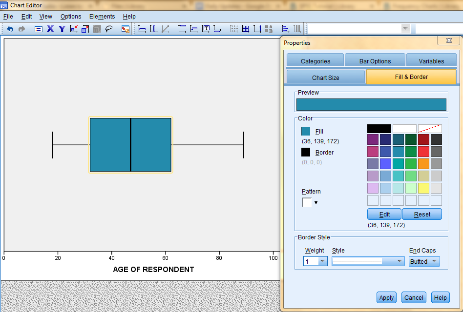
Chart of Means (Relationship Between Two Variables)
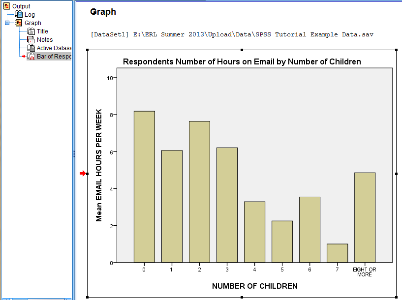
A chart of means displays the relationship between two variables (typically the relationship between a categorical variable and a continuous numerical variable). For example, the relationship between each respondents number of children (with each amount of children serving as a category) and number of hours spent on email per week (numerical) can be displayed in a chart of means, with the categorical variable (number of children) on the x-axis and the numerical variable (number of hours) on the y-axis.
To generate a chart of means, click on 'Graphs' in the toolbar at the top of the Data Editor window. Then, click 'Legacy Dialogs' in the dropdown menu and 'Bar...' in the side menu.

In the Bar Charts dialog box that pops up, select the 'Simple' icon and 'Summaries for groups of cases' option. Then, click 'Define.'

In the Define Simple Bar: Summaries for Groups of Cases dialog box that pops up, click on the categorical variable of interest (Number of Children) in the variable list to add it to the 'Category Axis:' field. In the 'Bars Represent' field, select the 'Other Statistic (e.g. Mean)' option. Then, click on the numerical variable of interest (Email Hours per Week) in the variable list to add it to the 'Variable:' field. Then, if you would like to add a title to your chart, click 'Titles...'

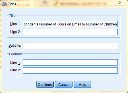
In the Titles dialog box that pops up, type in your desired title. Then, click 'Continue.'
In the SPSS Viewer window, the output is displayed. Double click on the chart to bring up the Chart Editor window to edit the chart, make it more visually appealing, and easier to interpret.
If you woud like to change the bar fill color, double click on the bars to bring up the Properties dialog box. Then, in the Fill & Border tab, select the desired fill color, and click 'Apply.' Please note: the changes you make in the Properties dialog box will not be reflected in the chart in the Chart Editor window until you click on Apply. Furthermore, the changes applied in the Chart Editor window will not be reflected in the chart in the SPSS Viewer output window until the Chart Editor window is closed.
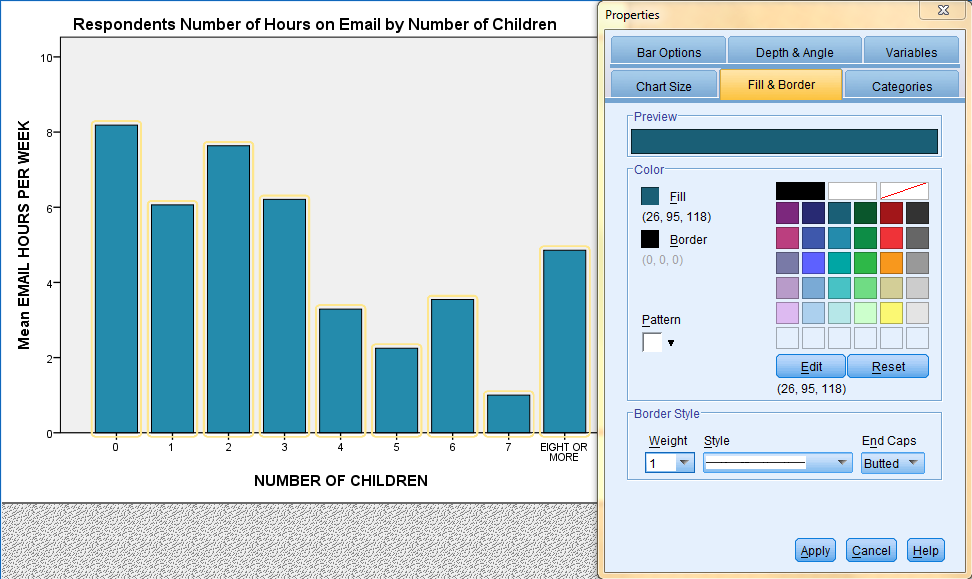
Chart Templates
The formatting settings applied to a chart in the Chart Editor window that make charts more visually appealing and easier to interpret can be saved as a ‘Chart Template’ that can be applied to future charts to save time from future formatting. For example, here we will be saving a bar chart that had been transposed and recolored. Chart templates are saved as *.sgt files.
Save a Chart Template
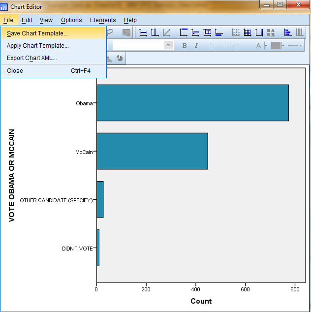
To save the formatting settings of a chart as a chart template, click on 'File' in the top toolbar of the Chart Editor window. (Remember, the Chart Editor window is accessed by double clicking on the chart in the SPSS Viewer output window.) Then, click 'Save Chart Template...'
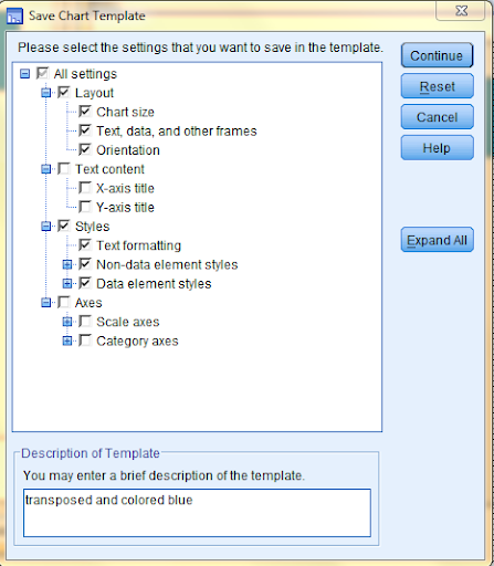
In the dialog box that pops up, select the formatting settings you would like to save in the template. Here, we selected all layout and style settings and did not select any of the other settings because we would like the titles and axes to be chart-specific. Then, at the bottom of the dialog box, add a description of the template, and then click 'Continue.'
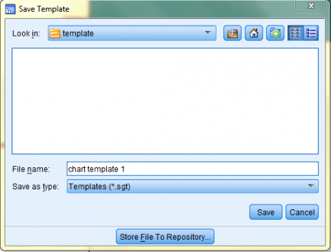
In the next dialog box, browse and find the desired save location for the template, and then name the template. Last, click 'Save,' and the template will be saved as a *.sgt file.
Apply a Chart Template
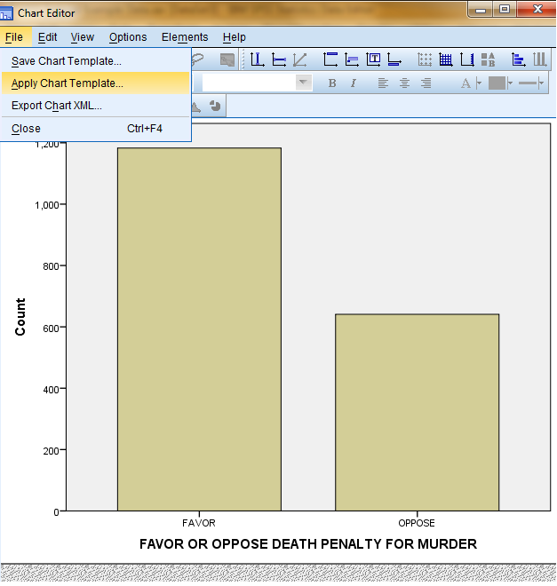
To apply a chart template to an unformatted chart, click on 'File' in the top toolbar of the Chart Editor window. (Remember, the Chart Editor window is accessed by double clicking on the chart in the SPSS Viewer output window.) Then, click on 'Apply Chart Template...'
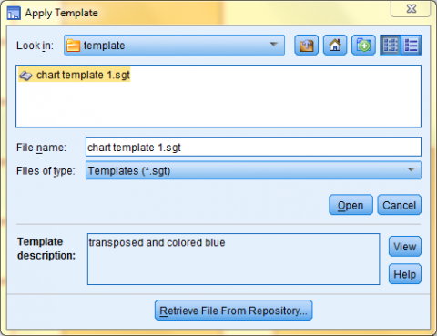
In the dialog box that pops up, browse for and select the desired template file. Click 'Open,' and the template will be applied.
The formatting settings of the chart template will be applied to the chart in the Chart Editor window. Remember, the changes applied in the Chart Editor window will not be reflected in the chart in the SPSS Viewer output window until the Chart Editor window is closed.
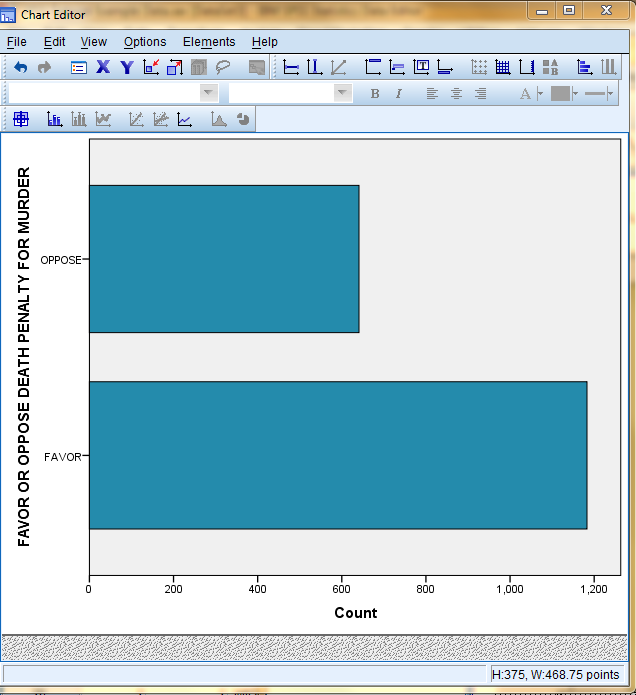
Templates are not chart specific. Specifically, templates made for bar charts can be applied to other types of charts such as histograms, line charts, etc...
Next: Hypothesis Testing
Previous: Descriptive Analysis