Charts
Creating a Chart
To create a chart, select the data that you want to be charted (if the data is in non-adjacent cells remember to hold down CTRL), go to the Insert tab and in the Charts group, and select the type of chart you want (Column, Line, Pie, Bar, Area, Scatter, or Other).
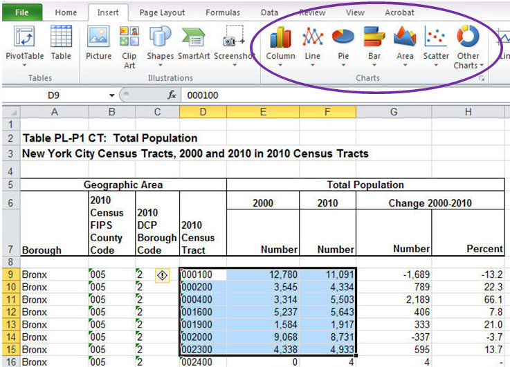
Select the chart type you want to create by clicking on the type and selecting one of the options from the dropdown menu. When you click on a chart, the data that shows up on the horizontal axis is outlined in purple, whereas the data in in each data series is outlined in blue.
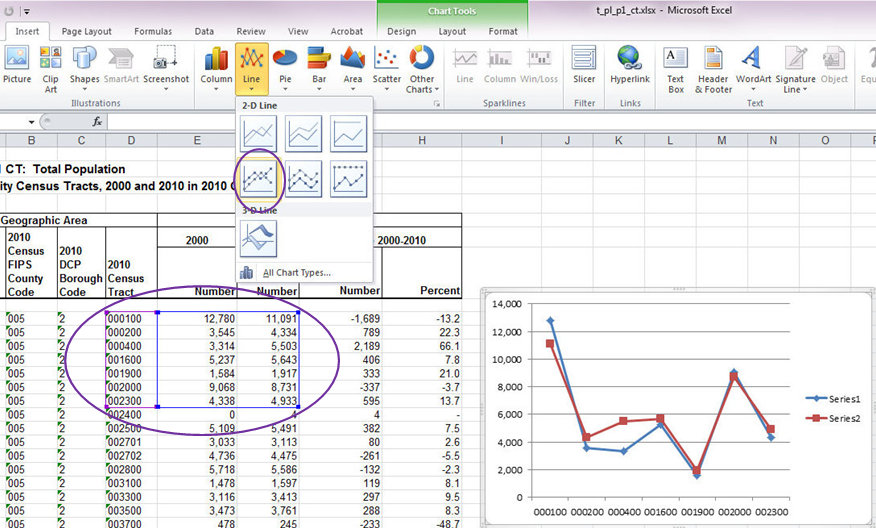
You should double check that this is how you want your data set up. In our example, the 2010 Census Tracts are along the horizontal axis and the population numbers for 2000 and 2010 are the two series, which is what we want.
Selecting Data
Sometimes you may want to change the selected data. There are multiple methods of doing so.
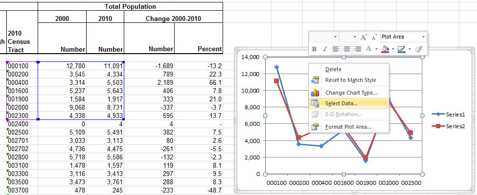
The first way to change the selected data is by right clicking on the chart and click on Select Data... from the dropdown menu.
The Select Data Source dialogue box will pop up. You can enter the new desired range of data in the Chart data range box, or you can edit individual series in the Legend Entries (Series) box by clicking on the desired series and selecting the Edit or Remove buttons. When you select Edit, the Edit Series dialogue box will pop up.
You’ll notice in our example that the series are called Series 1 and Series 2. We can change that by editing each series. After selecting the series that you want to edit and clicking Edit, the Edit Series dialogue box will open. To add an additional series, simply click the Add button and select the additional data that you would like to include.
You can also edit the horizontal axis labels by clicking the Edit button in the Horozontal (Category) Axis Label field.
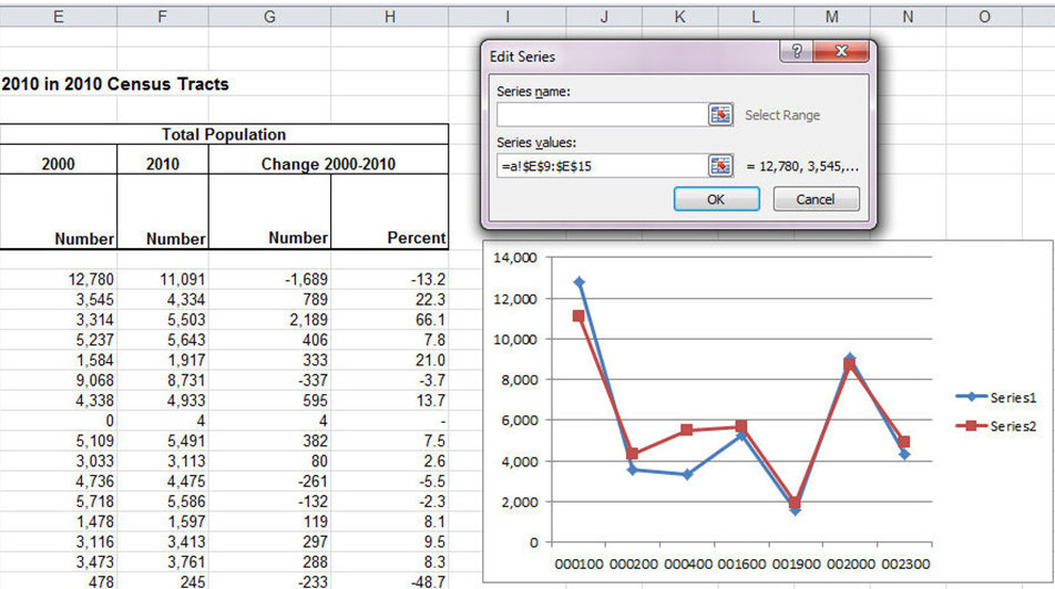
The following image displays the Edit Series dialogue box with the name of 'Series 1' changed to '2000.'
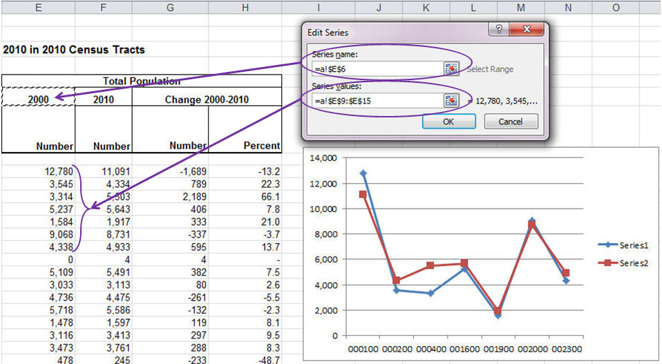
Another way to change the selected data is to click on the chart area to select the chart and then click on Select Data in the top Charts ribbon toolbar (specifically the Design tab of the Chart ribbon).

The Select Data Source dialogue box will pop up again, and the chart data can be changed as it was in the first method.
Inserting Chart without Selecting Data
You can also insert a chart without selecting the data first. The chart will appear as a white box because you haven’t selected the data for the chart.
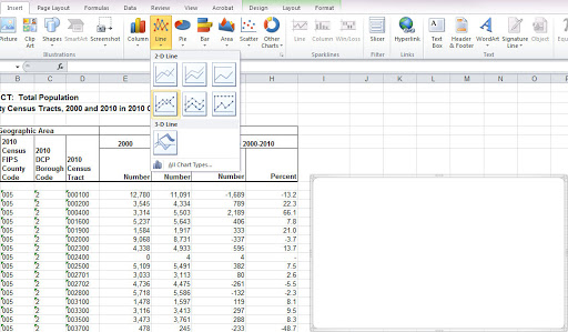
To select the data you will need to right click on the chart and click on Select Data. You can enter the range of data in the Chart data range box.
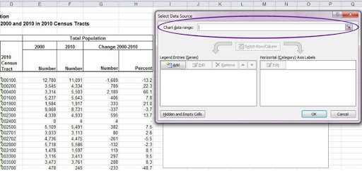
Make sure the cursor is in the Chart data range box and then select the data you want to graph.
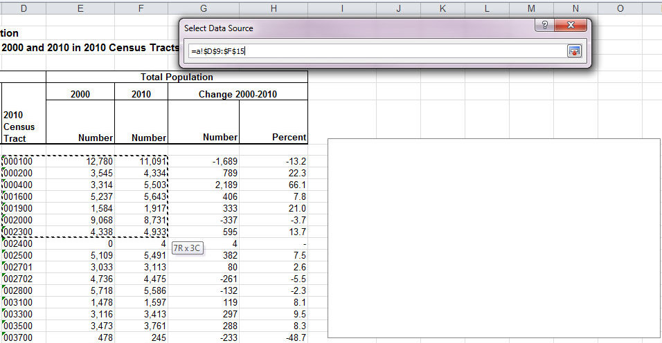
After you’ve selected your data, you’ll see that the Legend Entries box and the Horizontal Axis Labels box have the data in them.
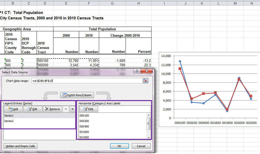
Chart Parts
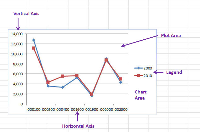
Move your mouse onto the chart and wait a second. Small labels will appear telling you which part of the chart your cursor is on (chart area, plot area, vertical axis, horizontal axis, or legend). There are tutorials on how to format each of these areas, which you can jump to by clicking on the links.
The Basics of Chart Tabs in the Ribbon
When you create a chart, 3 new tabs appear above the Ribbon under the heading Chart Tools. The tabs will disappear when you are not working on the chart. To access them, click on the chart.
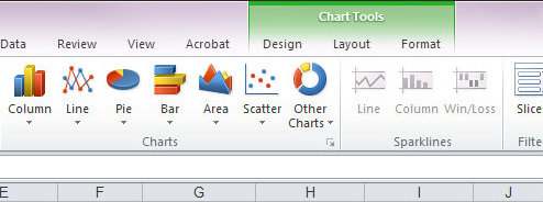
The tabs are designed to help you format and edit the appearance of the chart. We’ll go over the Chart Tools Tabs more in depth later (link here), but if you continue on to the next sections, we will cover most of the features you will likely be using.
Moving Charts with the Mouse
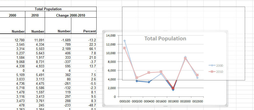
Scroll the mouse over the chart (it does not have to be selected already) and when the cursor looks like a black plus sign with arrows on the end of each line, click and hold down the mouse. Move the chart to the new location. A black outline will appear marking to where the chart is being moved.
Changing the Chart Size
Select the chart by clicking on it. The border will be slightly highlighted with a gray border. Move your mouse over the triple dots on each corner and in the center of the borders.
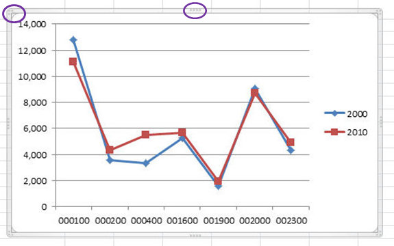
When the cursor looks like a double arrow then click and drag the borders of the chart to the preferred size. Solid lines will show the new size.
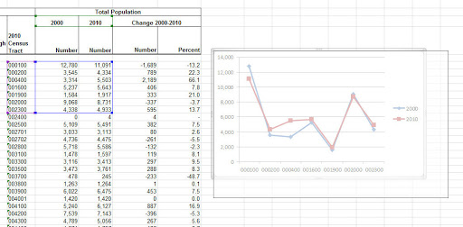
Release the mouse and the chart will be the new size. You can also alter the size of the chart in the Format Chart Area dialogue box as described in the next section below.
Formatting the Chart Area
The chart area refers to the area around the gridlines and the outer border. Scroll the mouse over an area that shows up as Chart Area (hold the mouse still for a second and the text will appear), then right click and select Format Chart Area. This will open the Format Chart Area dialogue box.
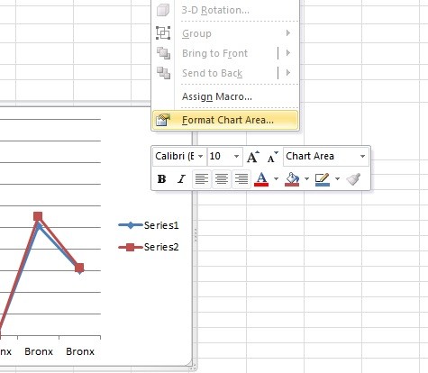
Alternatively, you can reach this dialogue box by going to the Format tab or the Layout tab under Chart Toolsand selecting Chart Area from the dropdown menu found at the top of the Current Selection group (far left of the Ribbon). Then select Format Selection.

Or you could use the quickest way to open the dialogue box, which is to double click on the chart area.
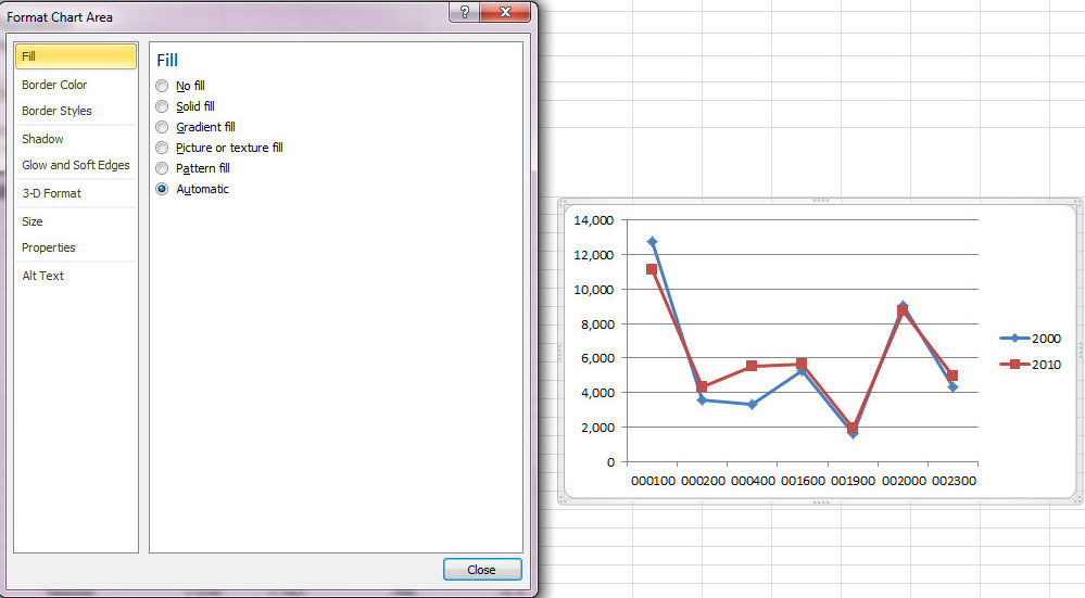
You can make many visual adjustments in Fill, Border Color, Border Styles, Shadow, Glow and Soft Edges, and 3-D Format. Be aware of the visual presentation appropriate for the discipline or your project. Some fields prefer clarity and simplicity, others may prefer something flashy or dynamic.
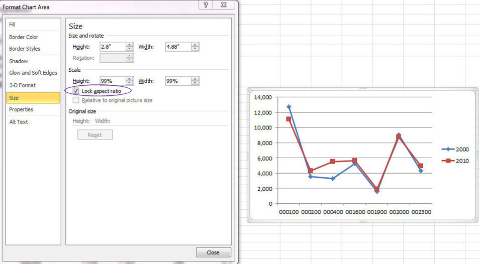
Under Size you can alter the size of the chart. You can also lock the aspect ratio, which will maintain the length to width ratio when the chart is resized, by clicking on the box next to Lock aspect ratio.
Formatting the Series
Sometimes you want the data series to look different than the default used by Excel. To change the colors, shapes, and other features of the series, double click on the data series, or right click on the data series and select Format Data Series from the dropdown menu. Each point on the line (when it is a line graph) will be selected. When data lines are very close to each other, it can be difficult to isolate them to format them. One way to address that is by hovering your mouse pointer over a datapoint in your graph. A small yellow box will appear indicating which series the datapoint belongs to.
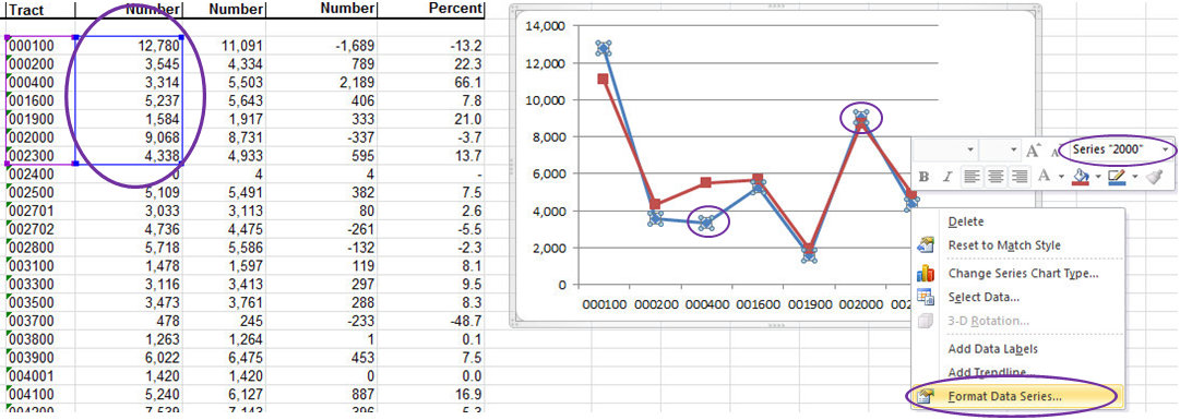
When you select a data series, each point on the line (when it is a line graph) will be selected. You’ll also see that the data that corresponds to the series will be outlined in blue. Furthermore, the selected data series will be listed at the top of the dropdown menu in the upper right corner of the formatting box that always appears when you right click in Excel.
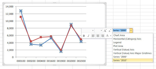
You can also reach the Format Data Series dialogue box from the Layout tab or Format tab, both under Charts toolbar, by selecting the specific data series from the dropdown menu in the Current Selection group on the left side of the Ribbon and clicking Format Selection.
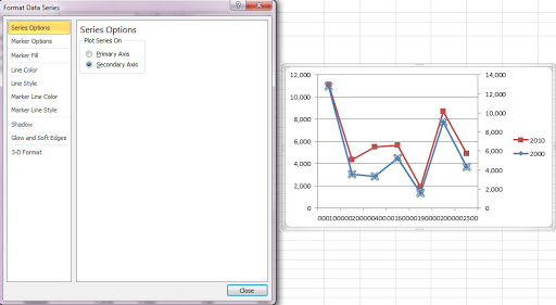
Looking at the Format Data Series dialogue box, under Series Options, you have the option of a primary and secondary vertical axis. There are occasions where you might want two vertical axes, in which case you can decide which data series will be on the Primary Axis and which on the Secondary Axis by selecting the appropriate bubble. However, use this feature cautiously as it will make reading the graph much more difficult. It is completely unnecessary with the current data set, but you can see how selecting Secondary Axis automatically adds an additional vertical axis and makes the graph more complicated to read.
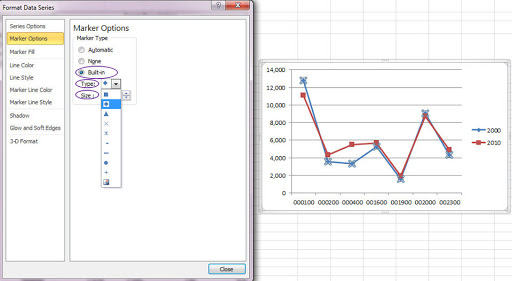
You can change the Marker Type as well as the size under Marker Options. Be sure to select Built-in.
You can also change the color of the Marker. Select Solid fill or experiment with the other options.
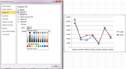
If you change the color of the marker, you’ll probably want to change the Line Color and the Marker Line Colorunless you don’t want them to match.
You can also alter the Line Style and the Marker Line Style. This is useful for changing the thickness of lines or for making dotted lines, both of which can help with visibility. I suggest experimenting with the options to find out what you like.
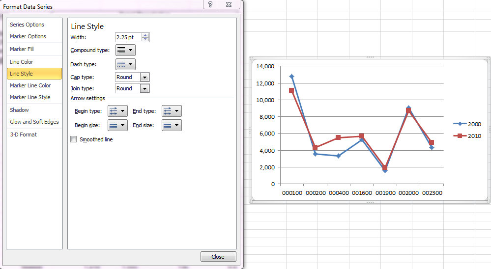
There are also other visual alterations you can make with Shadow, Glow and Soft Edges, and 3-D Format.
To format other chart types, the process is the same, although some of the options will be different.
For example with a pie chart you can see that there are no axes under Series Options (because a pie chart doesn’t have axes), but instead you can alter the slices. Also, you’ll notice Border Color and Border Styles have replaced Marker Color, Line Color, Marker Line Color, etc.
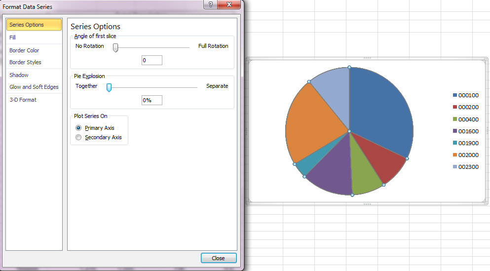
Please note that a pie chart is completely inappropriate for this data. Not sure why? Visit the ERL.
Inserting a Chart Title
In the Layout tab under Chart Tools (remember to click on the chart if you do not see the Chart Tools tabs) click on Chart Title in the Labels group.
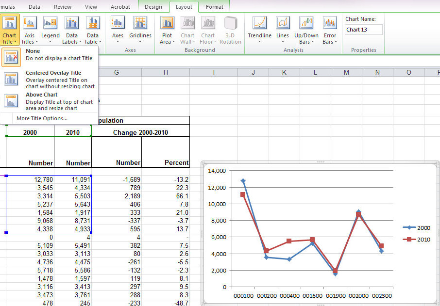
You can choose to center the title over the plot area (Centered Overlay Title) or display it above the plot area (Above Chart). Which you choose may depend on standards in the discipline, requirements for the project, or what you think looks better. Once you decide and click on your preferred option (the below example shows the overlay), type the chart title. You should notice 2 things in the example below:
1. A box on over the plot area says Chart Title. This is where the chart title will appear.
2. The typed title appears in the Formula bar.
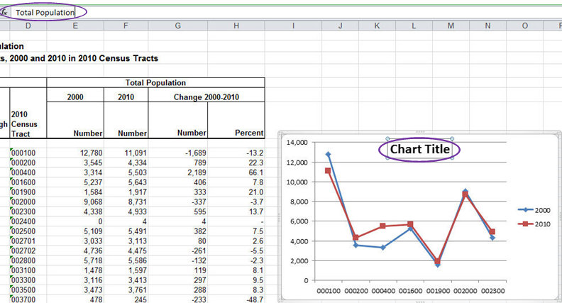
Once you press ENTER the title will appear on the chart.
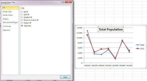
Back in the Labels group of the ribbon, None is an option in the dropdown menu in case you want to remove the chart title after adding it. (You can also click on the chart title border and press DELETE or BACKSPACE to remove the title.) Clicking on More Title Options opens the Format Chart Title dialogue box where you can format aspects of the chart title. This allows you to alter features of the chart title except for the font.
Formatting the Chart Title
To alter the font, select the chart title (click on it once), and then click on the text to be able to edit the text. You can format the font using the standard font options under the Home tab in the Font group. The text will not appear in the formula bar, but you can change it directly in the chart title box.
To move the chart title, single click on the chart title box, and then move the cursor over one of the borders. When the cursor changes to a cross with arrows at each end, click the mouse and move the chart title to where you would like it to be. Blue dotted lines will mark the new location. When you release the mouse, the title will be moved.
Changing the Size of the Plot Area
Click on the plot area and you will see light blue dots appear around the plot. Data on the horizontal axis is outlined in purple, while data for the series is outline in blue.

Move the mouse over one of the dots and when the double arrow appears, click and drag the border of the plot to the desired size. Light blue dotted lines will show the new border location. Notice that the plot area includes the area around the axes so if you increase the plot area, the axes will move with it.
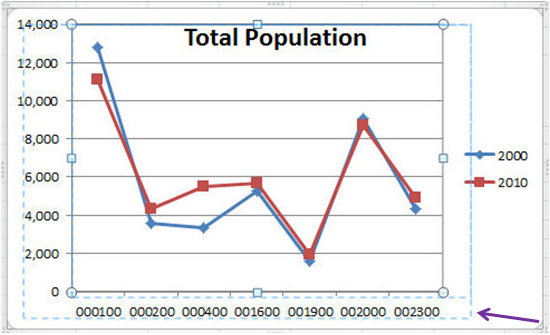
Changing the size of the plot area may also require you to format the axes, the legend, and chart and axis titles, if you include them. Click on the links if you want to jump ahead (or back) to these topics.
Format Plot Area
As with formatting the chart area, formatting the plot area allows you to change visual features of the plot area. Scroll the mouse over the gridlines so that the cursor says Plot Area (give it a second) and right click. The Format Plot Area dialogue box will appear. You can also get to this dialogue box by clicking on Plot Area in the Background group under the Layout tab and selecting More Plot Area Options.
Alternatively, you can reach this dialogue box by going to the Format tab or the Layout tab under Chart Tools and selecting Plot Area from the dropdown menu found at the top of the Current Selection group (far left of the Ribbon under both tabs). Then select Format Selection.
The quickest way to open the dialogue box is to double click on the plot area.
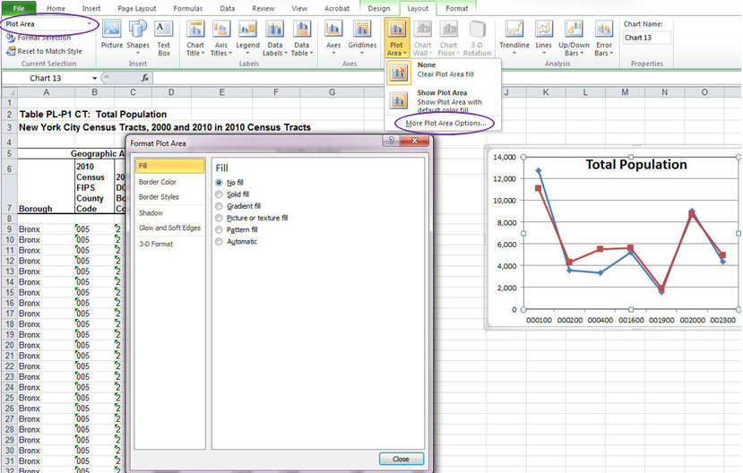
You can alter the Fill, the Border Color, and the Border Styles of the plot area. You can also add Shadow, Glow and Soft Edges, or 3-D Format to the plot area. As with formatting the visual aspects of the chart area, follow the standards of the discipline, the requirements of the project, or your own intuition.
Formatting the Horizontal Axis
Right click on the horizontal axis and select Format Axis from the dropdown menu. Because the axis is overlaid on the chart area, sometimes you will not get the correct dropdown menu (you will see the option to Format Chart Area instead). You can tell when the axis is selected because light blue dots will appear on the corners.
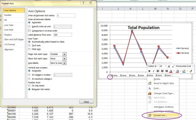
Alternatively you can reach the Format Axis dialogue box by going to the Format tab or the Layout tab under Chart Tools and selecting Horizontal (Category) Axis from the dropdown menu found at the top of the Current Selection group (far left of the Ribbon). Then select Format Selection. Or click on Axes in the Axesgroup under the Layout tab. Then select Primary Horizontal Axis and More Primary Horizontal Axis Options. Other options under the Axes button in the Axes group include reversing the order of the labels (diplaying them left to right or right to left) and showing the axis without the labels or tick marks.

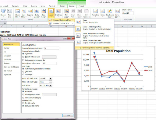
The quickest way to open the Format Axis dialogue box is to double click on the horizontal axis.
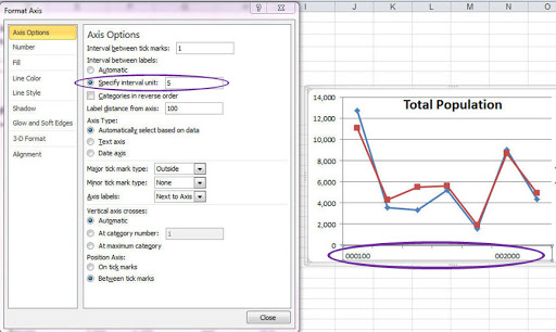
Under Axis Options there are, well, a lot of options for altering the axis that I encourage you to experiment with. For example, you can specify the number of categories between tick marks. Click on Specify interval unit and then change it from 1 to 2 and every other label will be shown. Change it to 5 and only 2 of the labels will be shown (e.g. every 5th).
You can alter the appearance of tick types by choosing options in the Major tick mark type dropdown menu. Selecting Outside has them outside of the plot area and selecting None removes them, which is what we've chosen in the following example (notice the tick marks in the previous graphs?).
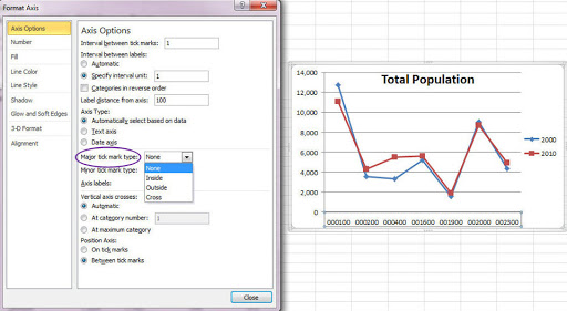
It is also useful to know how to change the location of the axis labels. You can do this by clicking the dropdown menu of the Axis Labels option.
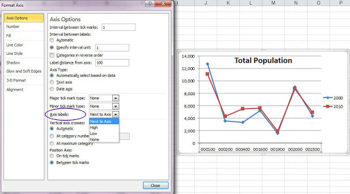
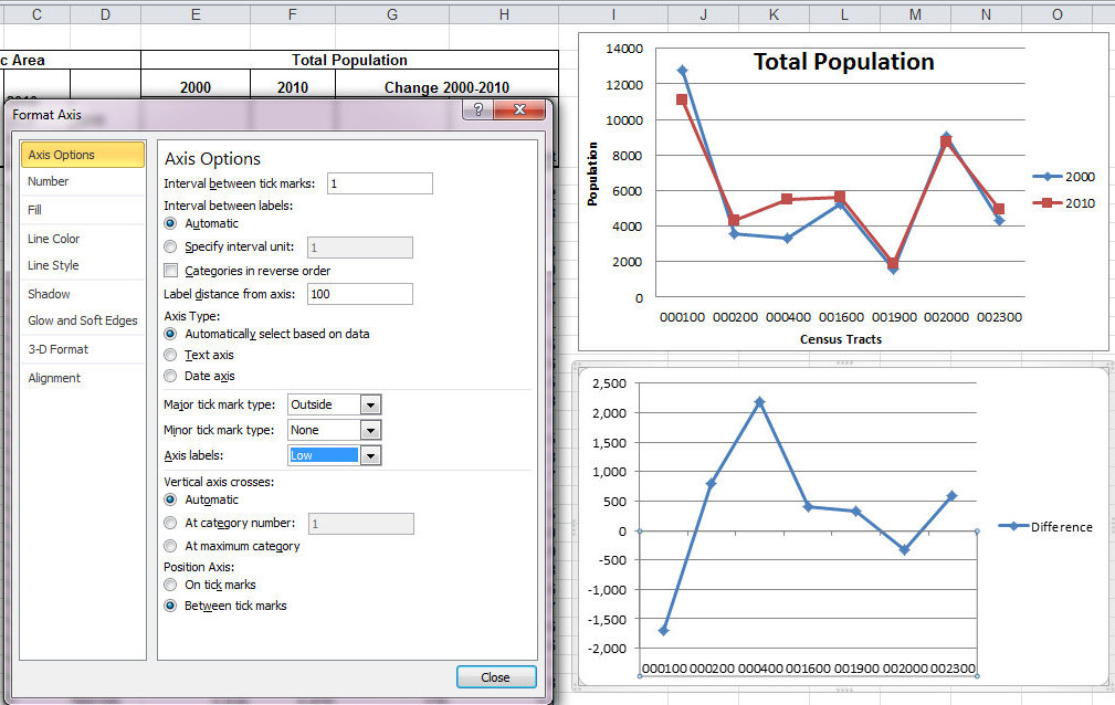
High will move the axis labels above the plot area. If the axis is not at the bottom of the plot area (e.g. if there are negative numbers in the graph) you can select Low to move the axis labels to be below the plot area. In this example, because the axis is at the bottom of the plot area, Low and Next to Axis will be the same.
The Number section will allow you to format the numbers presented in the axis labels. Additionally, all kinds of visual changes can be made in Fill, Line Color, Line Style, Shadow, Glow and Soft Edges, and 3-D Format. Use your own discretion when experimenting with these features. Alignment will change the alignment of the labels and will also allow you to change the text direction (horizontal, rotated, stacked).
Formatting the Vertical Axis
As with the horizontal axis there is a dialogue box for modifying the vertical axis. To get to it, right click on the vertical axis and select Format Axis. Remember that the axis is overlaid on the chart area, so make sure you are actually on the axis when you right click. You can tell when the axis is selected because light blue dots will appear on the corners.
Alternatively, you can reach this dialogue box by going to the Format tab or the Layout tab under Chart Toolsand selecting Vertical (Value) Axis from the dropdown menu found at the top of the Current Selection group (far left of the Ribbon). Then select Format Selection.
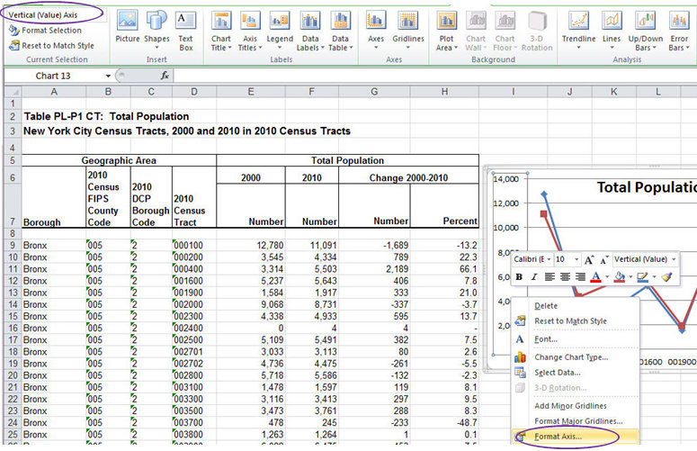
OR you can go to Axes in the Axes group under the Layout tab. Then select Primary Vertical Axis and More Primary Vertical Axis Options. You can also alter the number presentation in the Axes dropdown menu.
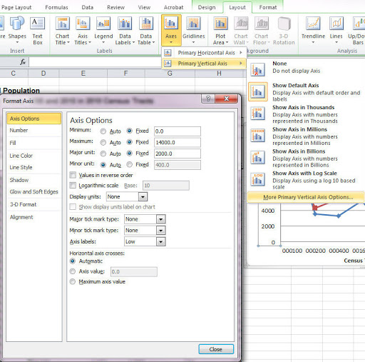
The quickest way to open the dialogue box is to double click on the vertical axis.
You’ll notice that the Axis Options menu is different for the vertical axis than it was for the horizontal axis.
One of the single most important things to know about graphs is how to alter the size of the vertical axis. Such a simple change can greatly alter the appearance of data and potentially the interpretation. The Minimum, Maximum, Major unit, and Minor unit will always be defaulted to Auto, however, by selecting Fixed you can change the values in the text boxes thereby altering the size of the vertical axis. Here we changed the Minimum from 0 to 1000 and the Major unit to 1000 (which increased the number of gridlines). Be sure to note that the Major unit can never be smaller than the Minor unit.
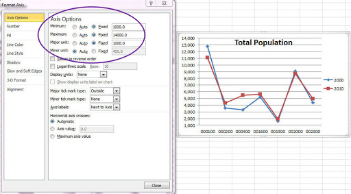
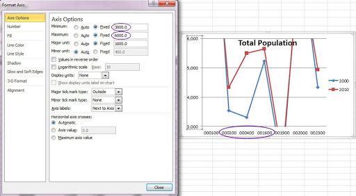
Let’s say I was really interested in the Census Tracts 000200, 000400, and 001600. I could alter the axis to focus in on those three. The apparent pattern changes when we zoom in. Of course, if I wanted to present these changes I would also remove the other data points (returning to Select Data and re-selecting the relevant data).
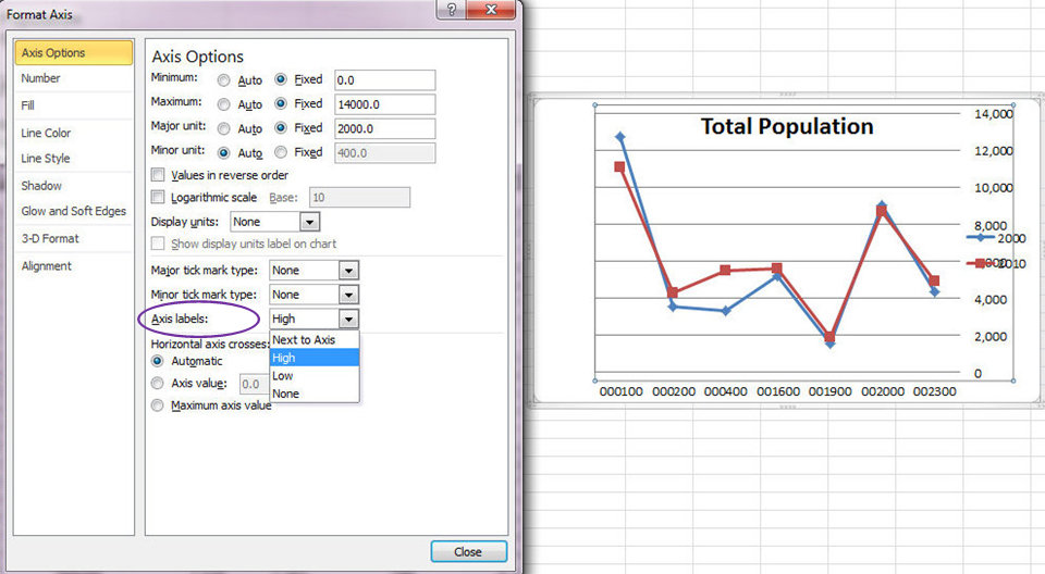
As with the horizontal axis options, you can alter the Major tick mark type, Minor tick mark type, and the Axis labels. Unlike the horizontal axis options, High moves the labels to the right side of the graph, while Low keeps them on the left side.
In the Number section you can format the number type of the values in the axis. In Fill, Line Color, Line Style, Shadow, Glow and Soft Edges, and 3-D Format you can format the visual presentation of the axis. Again, use your discretion when experimenting with these features. Alignment allows you to change the alignment of the text as well as the orientation (horizontal, rotated, stacked).
Axis Titles
With all of the formatting options in the Format Axis dialogue boxes for the vertical and horizontal axes, they do not allow you to add axis titles. To add axis titles you must go to the Layout tab under Chart Tools and select Axis Titles in the Labels group. As you might have guessed, you can select Primary Horizontal Axis Title or Primary Vertical Axis Title.

Primary Horizontal Axis Title
You can choose to display either the title below the axis or have no title at all.
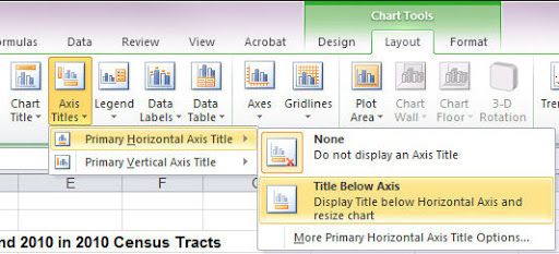
When we select to insert the title Axis Title appears below the plot area (if it doesn’t, you can resize the plot area so that it does). As with the chart title, after selecting insert we can type the title in the formula bar and after pressing ENTER it will appear where the box currently says Axis Title.
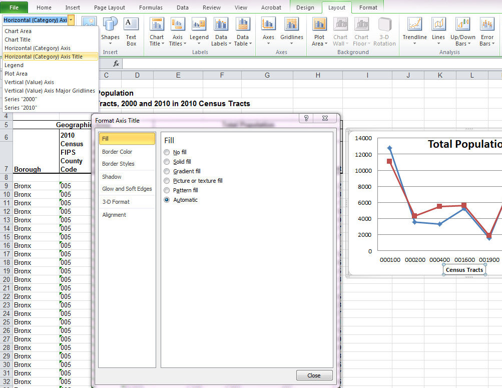
You can format the axis title by going to Axis Titles in the Labels group and selecting More Primary Horizontal Axis Title Options. Alternatively, you can select Horizontal (Category) Axis Title in the dropdown menu in the Current Selection group and clicking on Format Selection.
The quickest way to open the dialogue box is to double click on the axis title.

There are many options for formatting changes which I encourage you to explore and use at your own discretion. As with the chart title, you can change the font type, font size, or other font options by selecting the text (click once on the axis title to select it and then click once on the text) and making changes to the font as you would if it were typed into a cell (click here if you need a refresher).
Primary Vertical Axis Title
You can choose to disply either a rotated title, a vertical title, or a horizontal title or no title at all.
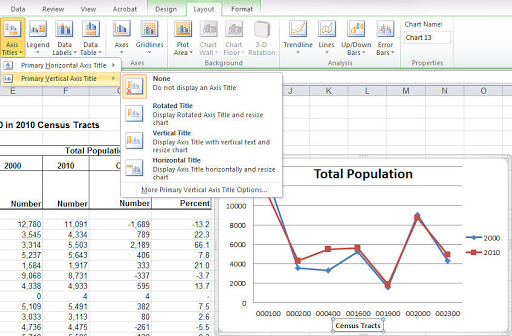
When we select to insert the title Axis Title appears to the right of the plot area (if it doesn’t, you can resize the plot area so that it does). As with the chart title, after selecting insert we can type the title in the formula bar and after pressing ENTER it will appear where the box currently says Axis Title. I’ve inserted a rotated title.
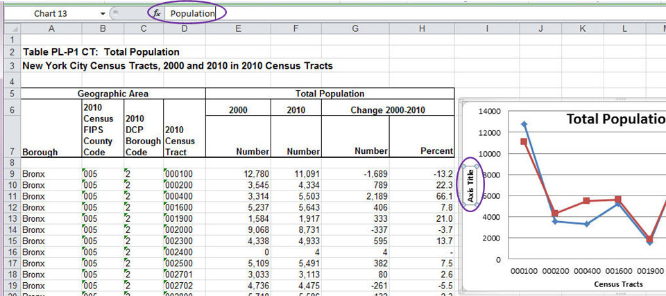
You can format the axis title by going to Axis Titles in the Labels group and selecting More Primary Vertical Axis Title Options. Alternatively, you can select Horizontal (Category) Axis Title in the dropdown menu in the Current Selection group and clicking on Format Selection.
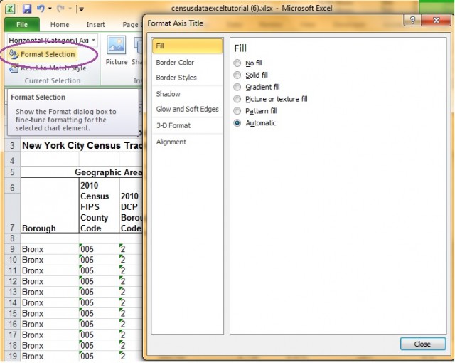
The quickest way to open the dialogue box is to double click on the axis title.
You can move the axis titles (or delete) them just like with chart titles.
If you've been following along in this tutorial, you can probably guess how to format the legend. But in case this is your first stop, here goes:
Legend Options
Right click on the legend (remember: the legend is on the Chart Area, so be sure the cursor says Legend (give it a second) as oppsed to Chart Area, otherwise you will not get the menu options you need). You can tell when the Legend is selected because blue dots appear on the corner. Select Format Legend from the dropdown menu.
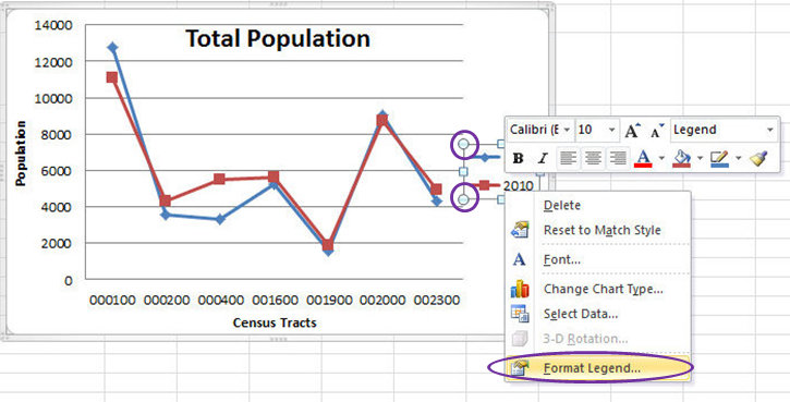
This will open the Format Legend dialogue box.
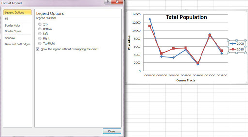
Alternatively, you can reach this dialogue box by going to the Format tab or the Layout tab under Chart Toolsand selecting Legend from the dropdown menu found at the top of the Current Selection group (far left of the Ribbon). Then select Format Selection.

Also, you can click on Legend in the Labels group under the Layout tab. This also has options for moving the legend around.
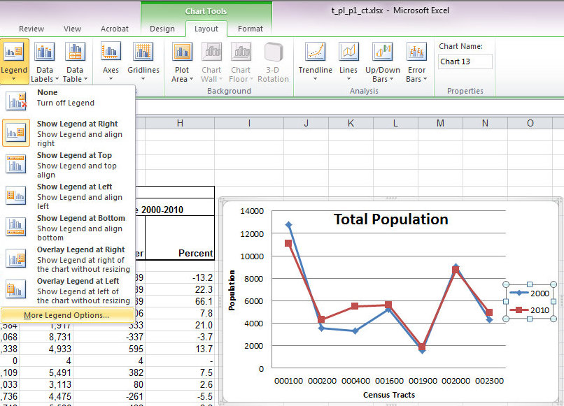
The quickest way to open the Format Legend dialogue box is to double click on the legend.
Under Legend Options in the Format Legend dialogue box, you can change the legend position by clicking on the preferred location. You can also let the legend overlap the plot area by unchecking the box next to Show the legend without overlapping the chart. Additionally, all kinds of visual changes can be made in Fill, Line Color, Line Style, Shadow, Glow and Soft Edges, but there's no 3-D Format for the legend. Use your own discration when experimenting with these features.
Resizing the legend
You can resize the legend with your mouse just like you can with the chart.
Lengend Font
Finally, to alter the font size, style, or type, click on the legend and use the options in the Font group under the Home tab, just like you would with the chart title. You can't alter the text like you can with the chart and axes titles. To change the text in the legend you need to right click and go to Select Data and edit the series name.
Copying Charts
You can copy a chart. For example, you may want to copy a chart from one worksheet to another. Scroll the mouse over the chart you want to copy that shows up as Chart Area, then you can right click on the chart area to select copy or copy per your preferred method.
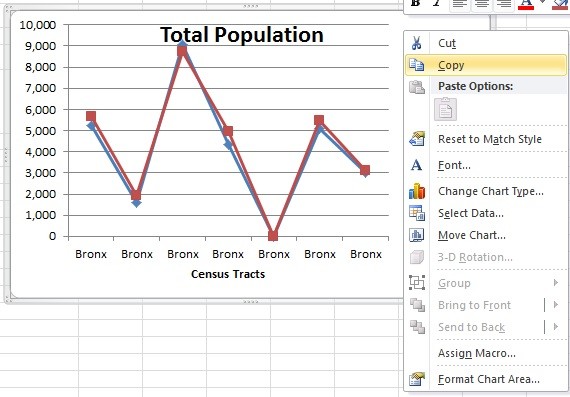
Another example: you might copy a chart and then select new or different data for the second version of the chart. This can be especially useful if you want the titles, axis labels, or the appearance of the series to be the same if you had already taken the time to format them.
In this case you can copy the chart and reselct your data. (Recall how to select data)
Cutting Charts
You also cut a chart. Scroll the mouse over the chart you want to copy that shows up as Chart Area, then you can right click on the chart area to select cut or cut per your preferred method.
Pasting Charts
Select the cell that you would like to place the top left corner of the chart, and then paste per your preferred method.
Of course, you can also move a chart with your mouse.
Copying Data from one Chart into Another
You can also use Copy to copy the information from one chart into another chart. For example, let's say I wanted to make a chart of the change between 2000 and 2010:
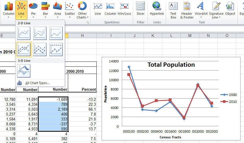
Notice that I chose data points that line up with the horizontal axis.

I went to Select Data and changed the name of the series and the labels on the horizontal axis.
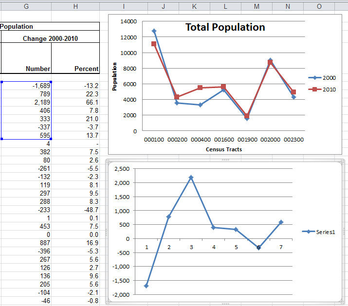
I shifted the horizontal to Low so that it would be below the plot area.
Then I added chart and axes titles.
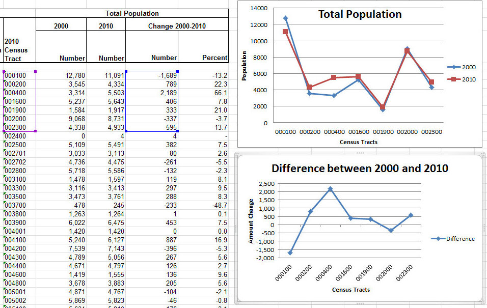
Of course, I would also like to resize the plot area and move the legend around differently, or delete it entirely since there is only one series, but I really wanted to show you how to copy and pasted the data from the new chart into the old chart. So let's get to it!
Copy the new chart (you can also cut if you want to completely remove the chart). Then select our original chart and paste.
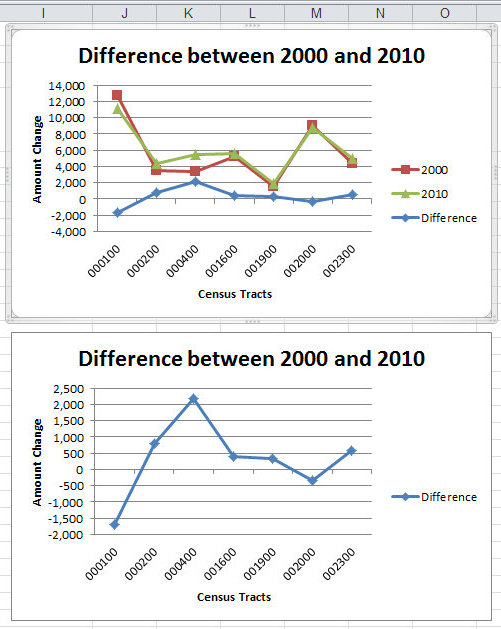
You'll notice the top chart now has a third series (Difference). The axes were automatically reformatted by Excel to account for the additional data points.
It is important to think about why you might combine series or different data sets within a single graph. Ask yourself things like:
What exactly is the graph presenting?
How can we interpret that information?
Does it help explain or clarifiy the results?
Thinking about these questions, do you think it is appropriate to merge the two graphs as we've done? If you're not sure, send us an email or drop in during our open lab hours (see below).
To begin to generate theories and hypotheses from data, it helps to be able to see the relationship between two variables. We can do this in a plot by adding a trendline to the figure, which fits a line to the data in order to identify the relationship. To do this, let's first download a new dataset here. These data allow us to see the relationship between unemployment rates and voting behavior, as well as look at voting behavior over time.
Adding a Trendline
First, let's make a scatterplot of total voting percentages versus unemployment rates. Refer to earlier in the tutorial if you don't remember how to do this. We get the following figure:
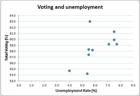
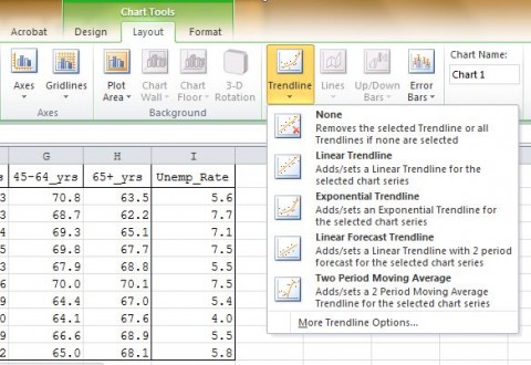
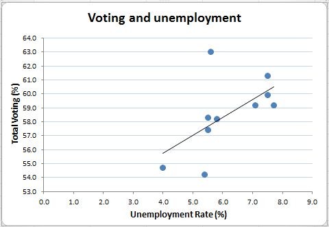
Now we want to fit a line to this scatterplot that best represents the relationship between the data. It looks like higher unemployment rates correspond to higher voting rates. To see what a linear relationship looks like, we fit a line to this figure. Click on your figure to select it, then click on "Layout" under "Chart Tools". Click on "Trendline" like in the image below, and add a linear trendline.
This will give us a trendline like the one below:
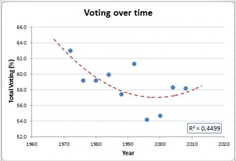
Fitting trendlines allows for many options. Sometimes, we can hypothesize that the relationship between our variables is not simply linear. For example, we hypothesize that the relationship of voting behavior over time is not linear. In the following case, we chose to plot an polynomial trendline and we can see that it bends downwards and then upwards as time increases. This relationship would not be visible if we used a linear trendline.
Formatting Trendlines
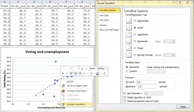
You can edit your trendline and see more options by right-clicking on the chart field to select it and choosing "Format Trendline" from the menu.
Adding Equation and R-Squared
Apart from editing the visual appearance of our line, we can choose a number of other options. One of the most important is to display a measure of how well your linear relationship fits your data. The R-squared value is a summary of how much of the variance a particular line explains. In the format box, check the boxes to display the equation and the R-squared values on your graph (seen at the bottom of the Format Trendline dialogue box above).
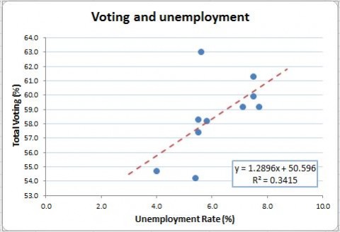
We can now see the equation of the line and the proportion of variance in the data explained by the linear relationship. Visually, this is the same process as running a regression of the Y-variable on the X-variable.
Adding Error Bars
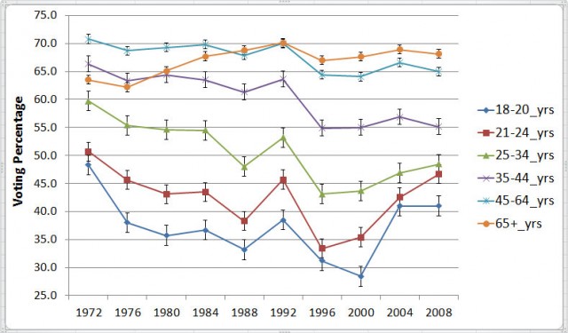
You can also add error bars to a chart to display estimates of uncertainty. For example, let's use this line graph showing changes in voting behavior over time by different age groups (forgot how to make a graph, find it here). Select the chart you made. Under Chart Tools select the Layout tab and then Error Bars.
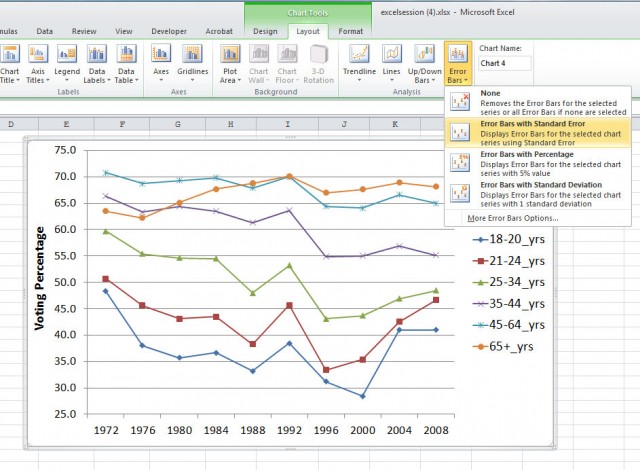
The chart now looks like this:
The linest function is a useful tool in Excel to fit a line (y= mx + b) to the data in order to identify the relationship between two variables (x and y). In addition to the fitted value, the linest function also produces uncertainty estimates for the fitted values, which we could not get from the trendline function. The linest function uses the least square procedure which fits a line to a set of data points by minimizing the sum of the squares of the residuals of the points from the curve. You can learn more about least square procedure here: http://mathworld.wolfram.com/LeastSquaresFitting.html
Calculating Linest Function
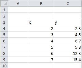
First of all, let us enter the data for which you want to calculate the linest function. Type your data in two columns, one for the x variables and one for the y.
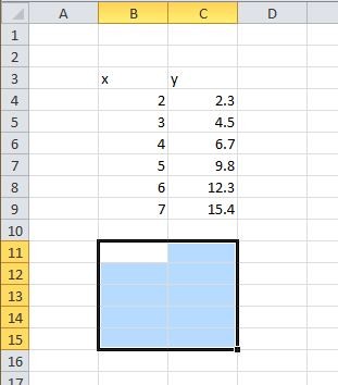
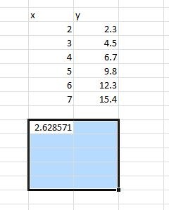
Select the area that will hold the statistics of the fitted function. Unlike other Excel functions, the linest function has multiple outputs. Each output appears in a different cell. In order to see all of the outputs, you need to select the appropriate number of cells in the appropriate locations. You should drag the mouse to form a 5 row by 2 column area to hold the results, as shown below. (We will explain why and what each entry means)
Click Formulas in the Menu and select Insert Function. In the pop up dialogue box, select the category “Statistical” from the drop down menu. And from that category, scroll down and select function “LINEST”.
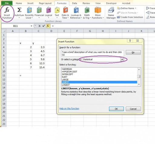
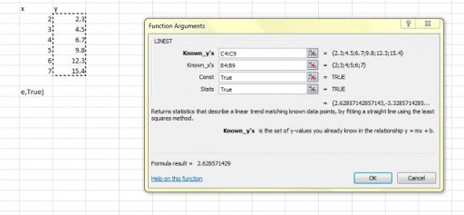
Click on OK and a dialogue box will show up to allow you to choose the data you want to fit a line.
Select the y and x values you want to fit with the linest function and type in “True” for the last two dialogue boxes. The first True indicates that you wish the line to be in the form y=mx+b with a non-zero intercept. The second True specifies that you wish the error estimates to be listed.
After you click on “OK”, you will see a number in the first box of your 5*2 matrix. This number is the coefficient m in the equation y=mx+b.
Getting Least Square Results
The next step will give you the error estimates and other information of your linear model. Highlight the entire formula in the formula bar for the cell containing the coefficient (in this example 2.628571), including the equal sign.
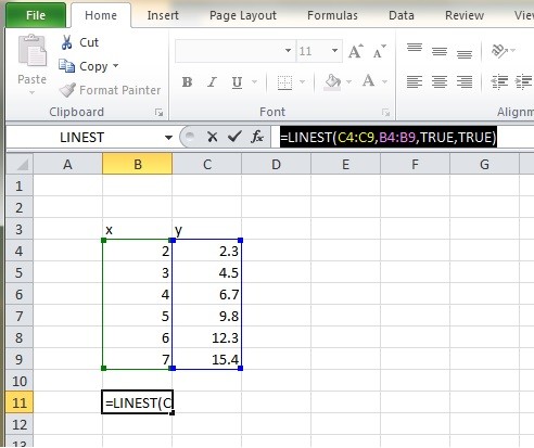
Hold down Control and Shift and press Enter.
Excel will add “{ }” brackets around the formula. You cannot type in the “{ }” yourself since Excel will treat the brackets as part of the formula. Then your least square results will show up in the 5*2 matrix.
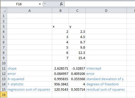
Error estimates for slope and intercept are useful for analysis in a variety of subjects.
Graphing Linest Function
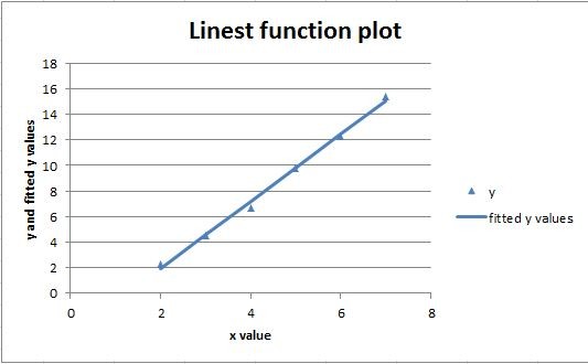
The next step, after getting all the estimates, would be to graph the data points and the fitted line. Notice that the fitted line plotted from the linest function will be the same line as the linear trendline. If you do not need the exact value of fitted y, you could skip the next step and simply add a trendline to the scatterplot of x and y.
We first calculate the fitted values. In the column after the y values, we created the fitted y values which are equal to x values * slope + intercept.
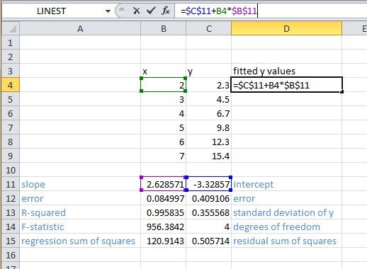
Since we are using the same slope (cell C11) and same intercept (cell B11) for all fitted values, we use absolute reference for the two cells. (Recall absolute reference here) Then we use auto fill to get all fitted y values. (Recall auto fill here)
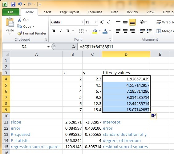
Now we have all information and we are ready to graph the results. Select the x, y and fitted y values and make a scatter plot first. (Recall how to create a chart here)
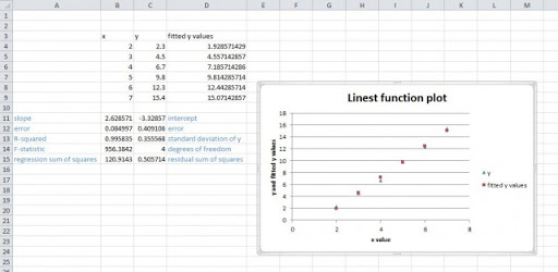
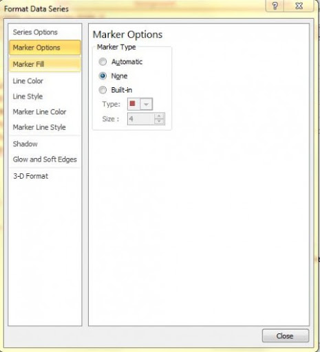
You can add titles, axis names and edit legend. (To get help editing charts) Then we replace the plotting symbols for the fitted y values with connecting lines. In order to do this, we double click on one of the fitted y value data points. The Format Data Series dialogue box will pop up. Change the marker type to none and line color to be solid line.
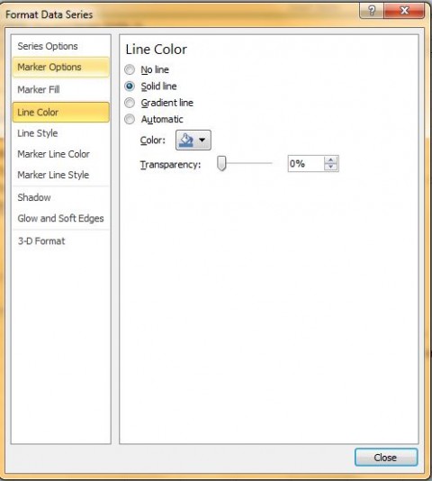
Click on close, and you will get the plot with fitted y values connected by a line.
In Excel, a pivot table can help you summarize your data based on different categories. You can gain a “big picture” of your data, and you can also edit your data in a more efficient way. For example, you want to analyze the sales data containing information of salesman, products, quantity, price, item, etc. Use pivot table will help you to quickly find out how different salesmen are performing.
Preparing the Dataset:
Before creating a pivot table, we need to make sure our dataset is well organized.
- The first row should contain column headings since Excel will use it as the field names in the pivot table.
- Do not leave blank rows or columns in the middle of your dataset, otherwise Excel will consider the empty column/row as the end of the dataset.
Once you have a well-organized dataset, you are ready to make a pivot table.
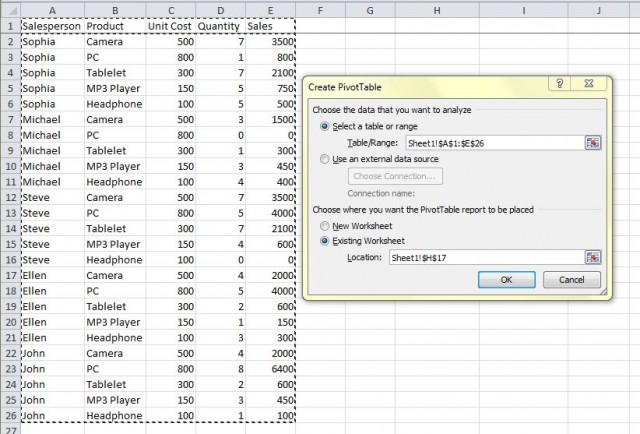
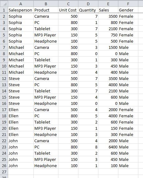
Here we have the data of products and their price that different salesmen sell.
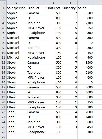
The dataset now is grouped by salesperson. If we want to get more information about sales by products or by revenue, pivot table would be a useful tool for you.
For example, we could make a pivot table that look like this.

This pivot table is a summary of quantity sold by salesmen (by row) and by products (by column). With this pivot table, we could get a clear idea of how many products of each category that each salesman sells.
Creating the Pivot Table
The first step to make a pivot table is to select the Insert ribbon and click on “Pivot Table”. On the drop-down menu, select “PivotTable”.
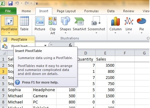
Then the “Create PivotTable” window should pop up and you could select data to make the pivot table. Under “Select a table or range”, select the data we want to use for the pivot table. You could also choose the location you want to put the pivot table. If you want the pivot table to be placed in another sheet, click on the icon on the right of the location area.
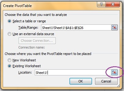
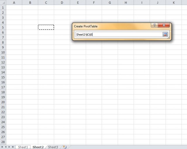
The default location is the sheet1, which is the location of the sheet you are currently working in. You can delete the default location and choose your own location to put the pivot table. For example, now we choose to put the table in cell C5 in sheet2. After you select the location, return to the main dialogue box by clicking on the icon on the right again.
Once we have selected data and location to make the pivot table, we can click ok. We will get a blank pivot table.
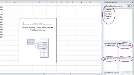
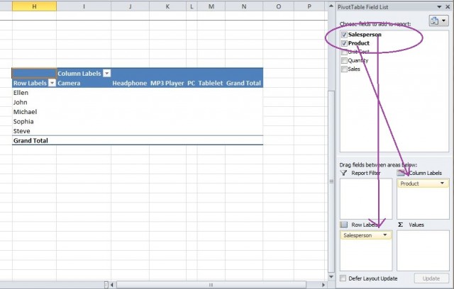
On the right of the excel window we could see a variety of options we could choose for the pivot table. We start from the top with the pivot table fields. We could choose different fields to add to our pivot table. These fields are all the column titles from the data table we choose. (That is why we want to have clear and informative column titles so it is easier for us to make the pivot table) For example, we choose Salesperson as the row labels, product as the column labels. In order to do this we can just drag the fields to the areas below. Now if we look at the pivot table, we have row and column labels displayed.
The next step would be to choose a value that we want to summarize. The possible values that we could summarize would be unit cost, quantity and sales. In this case, we want to summarize information about quantity sold. Thus we drag “Quantity” down to the Values area and we will get the pivot table that we want.
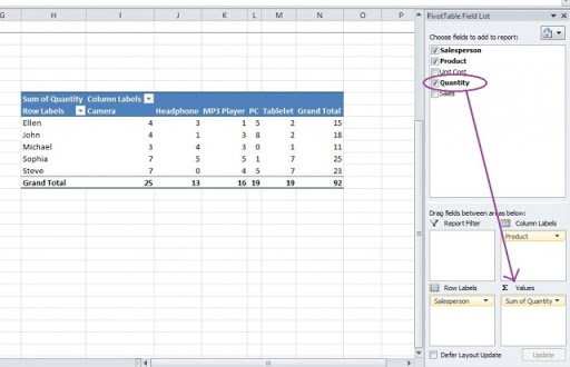
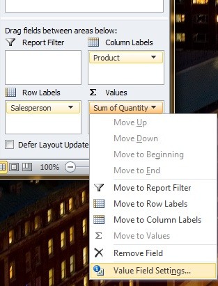
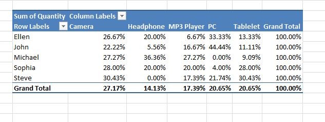
This table shows the quantity in different products sold by each salesperson. We could also choose to display the percentage instead of the counts. In order to do it, click on the Sum of Quantity in the Values area. In the drop-down menu, select Value Field Settings.
In the pop-up window, click the Show Values As. Then from the drop down menu, choose % of Row Total. (You can also choose other options such as % of Column Total according to which information you want to show in the table.)
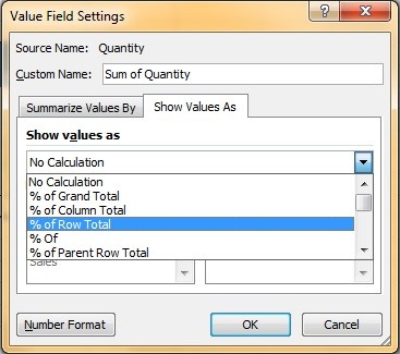
Click OK and you will get the pivot table showing percentage of each type of product that a salesperson sold.
Adding Subcategories
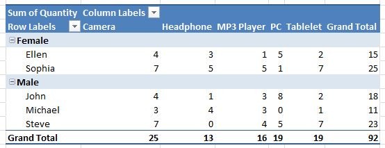
You could include more information in the pivot table by adding subcategories. For example, if we want to separate male and female salespersons. We first need to add a column “Gender”.
We use the same method mentioned above to create a blank pivot table that includes the gender data. We first drag Gender into the Row Labels and then Salesperson since the subgroup has to come first. We keep the Column Labels and Values same as in the previous example. This is the pivot table we get with gender as a subgroup.
Next: Formulas & Functions
Previous: Data Manipulation Basics