Regressions and Correlations
Regressions and correlations are analyses of linear relationships between quantitative variables that demonstrate the strength, direction, and significance of the linear relationship between the variables.
The strength of a relationship is measured by the Correlation Coefficient: Pearson's ‘r’ statistic, a value that ranges from -1 to 1. The closer the value to 0, the weaker the linear association between the two variables, and the closer to -1 or 1, the stronger the linear association.
The direction of a relationship is also measured by Pearson's 'r' statistic. If ‘r’ is positive, there is a positive linear association between the two variables (if one increases, the other increases). If ‘r’ is negative, there is a negative linear association between the two variables (if one increases, the other decreases).
The significance of a relationship determines whether the Pearson's ‘r’ statistic is a meaningful reflection of the linear relationship between the two variables or whether the relationship occurred by chance. When the Sig. value is .05 or less, the probability that the 'r' value was a product of chance is 5% or less.
However, please note that the correlations do not imply causation. Rather, they can be used to make predictions.
Bivariate Correlations
Bivariate Correlations are used to get the Correlation Coefficient: Pearson’s ‘r’ Statistic, which is a statistic that demonstrates the strength, direction, and significance of the linear relationship between variables.
This example will be looking at the linear relationships between the variables 'Age of Respondents,' 'Email Hours Per Week,' and 'Hours Per Day Watching TV.'
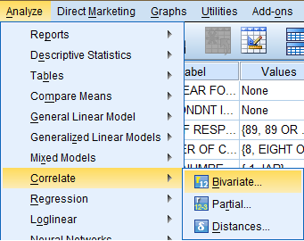
To calculate Pearson's r, click 'Analyze' in the top toolbar of the Data Editor window. Click 'Correlate' in the dropdown menu, and click 'Bivariate...' in the side menu.
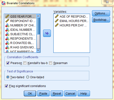
In the Bivariate Correlations dialogue box that pops up, select the variables of interest (Age of Respondents, Email Hours Per Week, and Hours Per Day Watching TV) from the list of variables and bring them over to the 'Variable(s):' field. Then, in the 'Correlation Coefficients' field, select 'Pearson,' and in the 'Test of Significance' field, select 'Two-tailed,' and at the bottom of the dialog box, make sure 'Flag significant correlations' is selected. If you would like to include descriptive statistics in the output, click 'Options.'
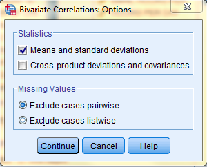
In the Bivariate Correlations: Options dialog box that pops up, select the desired descriptive statistics. Then, click 'Continue,' and, back in the Bivariate Correlations dialog box, click 'OK.'
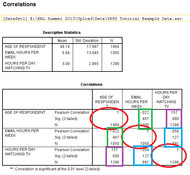
The output is displayed in the SPSS Viewer window. The output consists of two tables. The first table, Descriptive Statistics, contains descriptives information such as the Mean, Standard Deviation, and N for each of the variables. The second table, Correlations, contains information specific to the Bivariate Correlations procedure, such as Pearson's 'r' Statistic (the Correlation Coefficient), Sig. (2-tailed), and N. In the table, the variables are displayed in both the rows and the columns. The cells running on a diagonal circled in red represent the correlation of the variable with itself (which is not useful for analysis), so they can be ignored. The cells running along each diagonal in the other direction, squared in green, purple, and blue, each portray repeated statistical information regarding the correlations between the variables as well, so only one cell along each diagonal needs to be read and interpreted. In this example, the linear relationship between the age of the respondents and the number of hours per day spent watching tv is significant because the Sig. value is less than .05, but the linear relationship is pretty weak because the Pearson Correlation 'r' value (.157) is close to 0, and the linear relationship is positive because the Pearson Correlation 'r' value is positive.
A Simple Linear Regression, demonstrates the direction and significance of the linear relationship between two variables. It also identifies elements of the equation for the Least Squares Regression Line, the ‘best fit’ line of predicted y values given x. The equation for the Least Squares Regression Line follows the formula Y = a + bx. a is the Y-intercept (the point where the line hits the y-axis), b is the slope of the line, which is also known as the regression coefficient, and reflects how much Y will change each time x increases one unit. The slope of the line, b, is a step-size increase that is the same for all values of x and y because the relationship is linear. When b is positive, there is a positive association between the two variables (an increase in one yields an increase in the other), and when b is negative, there is a negative association between the two variables (an increase in one yields a decrease in the other).
This example will be looking at the linear relationship between the independent variable 'Age of Respondent' and the dependent variable 'Hours Per Day Watching TV.'
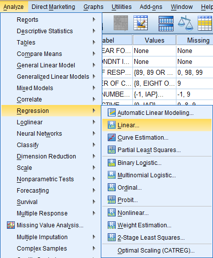
To run a Simple Linear Regression procedure, click 'Analyze' in the top toolbar of the Data Editor window. Click 'Regression' in the dropdown menu, and click 'Linear...' in the side menu.
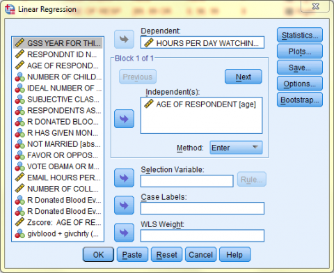
In the Linear Regression dialogue box that pops up, select the dependent variable of interest (Hours Per Day Watching TV) from the list of variables and bring it over to the 'Dependent:' field. Then, select the independent variable of interest (Age of Respondent) from the list of variables and bring it over to the 'Independent(s):' field. Click 'OK.'
The output is displayed in the SPSS Viewer window. The output consists of four tables. The first table, Variables Entered/Removed, tells which variables are being used in the procedure. The second table, Model Summary, displays the R, the R squared, the Adjusted R square, and the Standard Error of the Estimate. The third table, ANOVA, displays the Sum of Squares, df (degrees of freedom), Mean Square, F, and Sig. The fourth table, Coefficients, displays information relevant to the Least Squares Regression Line.
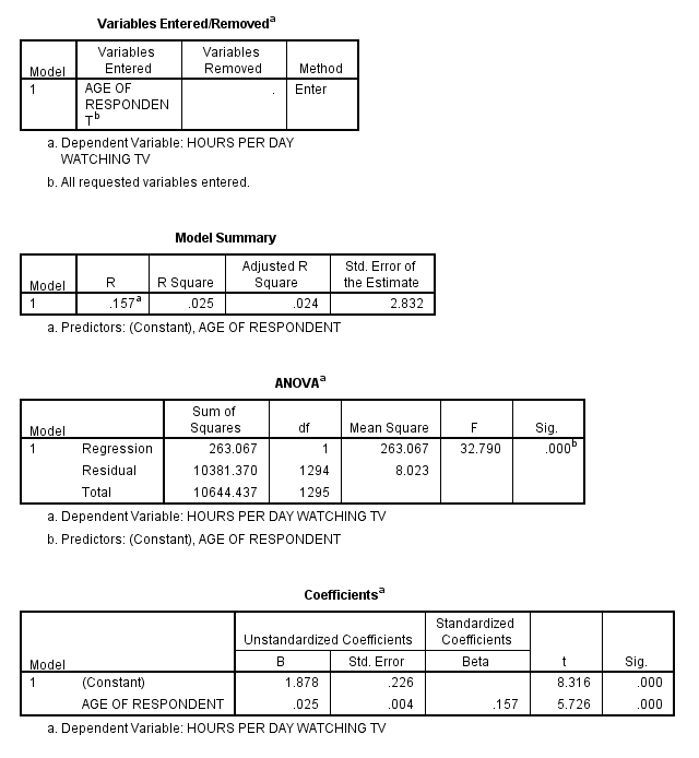
The fourth table, Coefficients, displays information relevant to the Least Squares Regression Line and that can be used in the formula Y = a + bx.
The cell in the first row, Constant, and the first column, B, is the a value in the equation for the Least Squares Regression Line, which is the y-intercept.
The cell in the first row of the second column is the standard error of the y-intercept, the average of how much the sample y-intercept differs from the population’s true y-intercept.
The cells in the last two columns of the first row represent the t value and the significance, indicating whether the y-intercept is significantly different from 0.
The cell in the second row, the independent variable Age of Respondent, and the first column, B, is the b value in the equation for the Least Squares Regression Line, which is the slope of the regression line in original units. The cell in the second row of the second column displays the standard error of b, representing the average of how much the sample’s b value differs from the population’s true b value. The last two columns represent the t value and the significance by examining whether the b, the slope of the regression, is significantly different from 0.
The cell in the third column of the chart, Standard Coefficients, reports the Standard Regression Coefficient, which can also be referred to as Beta. This value is the standardized slope of the regression line after scores from both the dependent and independent variables have been converted to standard Z-scores. This value is also the same as Pearson’s ‘r’ Statistic and is telling of the strength and direction of a linear relationship.
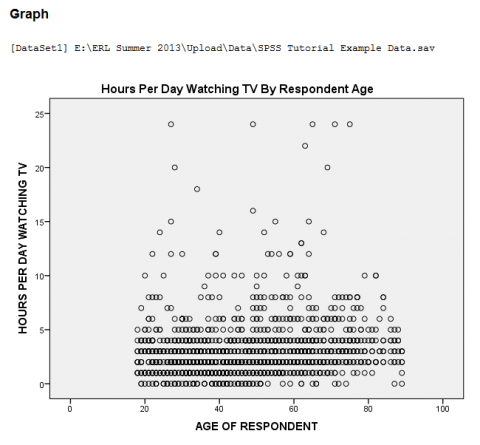
Scatterplots are visual representations of the relation between the two variables, with each data value as a dot on the scatterplot. Scatterplots can also feature regression lines.
This example will be generating a scatterplot to represent the relationship between the independent variable 'Age of Respondent' and the dependent variable 'Hours Per Day Watching TV.'
To generate a scatterplot, click 'Graphs' in the top toolbar of the Data Editor window. Click 'Legacy Dialogs' in the dropdown menu, and click Scatter/Dot...' in the side menu.
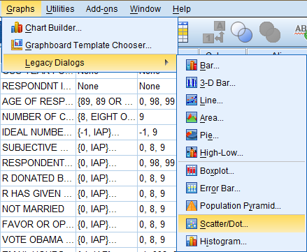
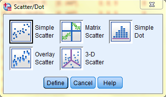
In the Scatter/Dot dialog box that pops up, select the 'Simple Scatter' icon. Then, click 'Define.'
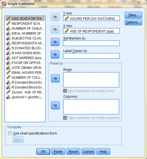
In the Simple Scatterplot dialog box that pops up, click on the dependent variable of interest (Hours Per Day Watching TV) in the variable list to add it to the 'Y Axis:' field. Then, click on the independent variable of interest (Age of Respondent) in the variable list to add it to the 'X Axis:' field. Then, if you would like to add a title to your chart, click 'Titles...'
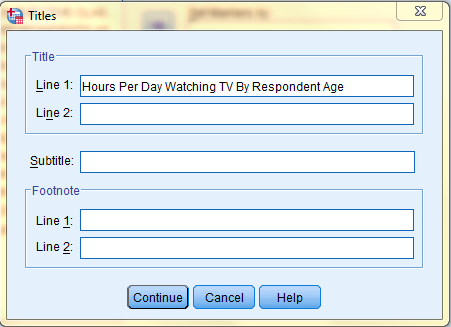
In the Titles dialog box that pops up, type in your desired title. Then, click 'Continue.' Back in the Simple Scatterplot dialog box, click 'OK.'
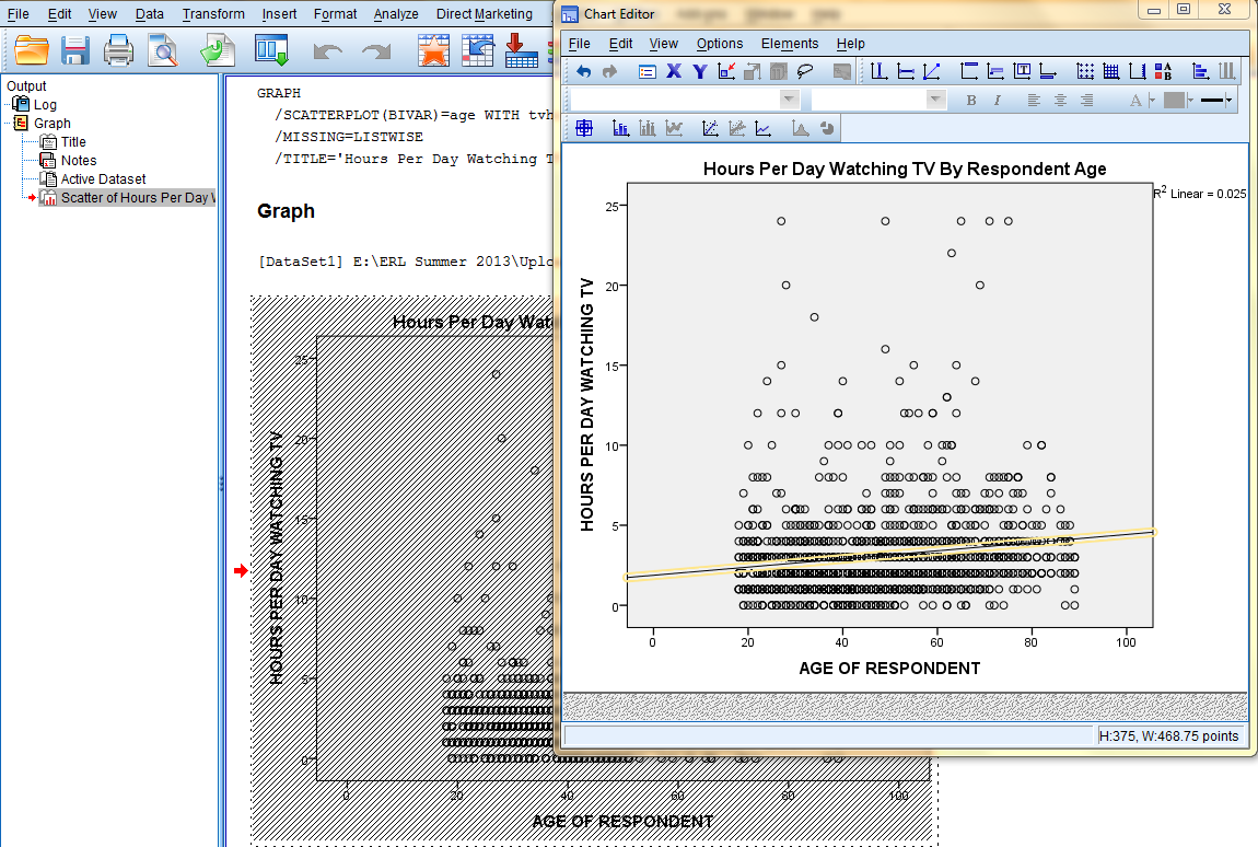
In the SPSS Viewer window, the output is displayed. Double click on the chart to bring up the Chart Editor window to edit the chart and add a Least Squares Regression Line.
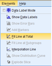
If you would like to add a Least Squares Regression Line, click on 'Elements' in the top toolbar of the Chart Editor window, and click on 'Fit Line at Total' in the dropdown menu to bring up the Properties dialog box.
Then, in the Fit Line tab of the Properties dialog box, in the Fit Method field, select the desired line type (Linear). Then, click 'Apply.' Please note: the changes you make in the Properties dialog box will not be reflected in the chart in the Chart Editor window until you click on Apply.
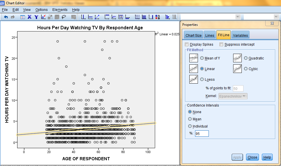
Furthermore, the changes applied in the Chart Editor window will not be reflected in the chart in the SPSS Viewer output window until the Chart Editor window is closed.
Regressions and correlations are analyses of linear relationships between quantitative variables that demonstrate the strength, direction, and significance of the linear relationship between the variables.
A Multiple Regression, demonstrates the direction and significance of the linear relationship between variables. It also identifies elements of the equation for the Least Squares Regression Line, the ‘best fit’ line of predicted y values given x and z. The equation for the Least Squares Regression Line follows the formula Y = a + bx + cz. a is the Y-intercept (the point where the line hits the y-axis), b reflects how much Y will change each time x increases one unit, and c reflects how much Y will change each time z increases one unit.
Multiple Regressions
Multiple regressions in SPSS are used to formulate the equation of the Least Squares Regression Line, the ‘best fit’ line of predicted values. Multiple regressions are also used to get the Correlation Coefficient: Pearson’s ‘r’ Statistic, which is a statistic that demonstrates the strength, direction, and significance of the linear relationship between variables.
This example will be looking at the relationship between the dependent variable 'Hours Per Day Watching TV' and the independent variables 'Subjective Class Identification' and 'Number of College-Level Science Courses R Have Taken.'
To run a multiple regression, click 'Analyze' in the top toolbar of the Data Editor window. Click 'Regression' in the dropdown menu, and click 'Linear...' in the side menu.
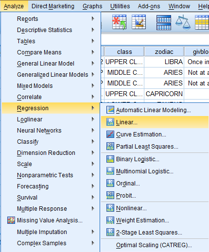
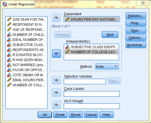
In the Linear Regression dialog box that pops up, select the dependent variable of interest (Hours Per Day Watching TV) from the list of variables and bring it over to the 'Dependent:' field. Then, select the independent variables of interest (Subjective Class Identification and Number of College-Level Science Courses R Have Taken) from the list of variables and bring them over to the 'Independent(s):' field. Then, make sure 'Enter' is selected in the 'Method' dropdown menu that is right under the 'Independent(s)' field. If you would like to include descriptive statistics in the output, click 'Options.'
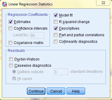
In the Linear Regression: Statistics dialog box, select the 'Descriptives' option and keep 'Estimates' and 'Model Fit' selected. Then, click 'Continue,' and, back in the Linear Regression dialog box, click 'OK.'
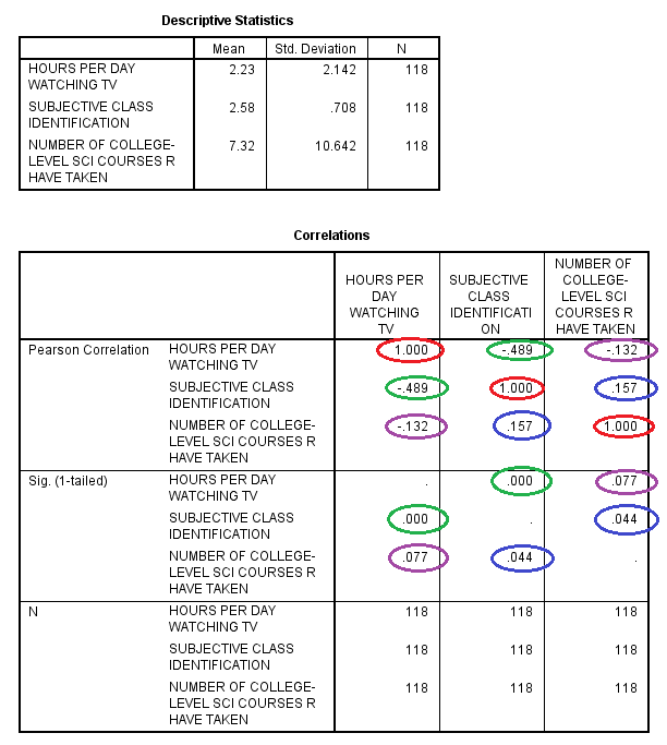
The output is displayed in the SPSS Viewer window. The output consists of six tables. The first table, Descriptive Statistics, contains descriptives information such as the Mean, Standard Deviation, and N for each of the variables. The second table, Correlations, contains information specific to the Multiple Regressions procedure, such as Pearson's 'r' Statistic (the Correlation Coefficient), Sig. (1-tailed), and N. In the table, the variables are displayed in both the rows and the columns. The cells running on the diagonal circled in red represent the correlation of the variable with itself (which is not useful for analysis), so they can be ignored. The cells running along the diagonals in the other direction, circled in green, purple, and blue, each portray repeated statistical information regarding the correlations between the variables as well, so only one cell along each diagonal needs to be read and interpreted. In this example, the linear relationship between the subjective class identification and the number of hours per day spent watching tv is significant because the Sig. value is less than .05, and the linear relationship is of medium strength because the Pearson Correlation 'r' value (-.489) is almost equidistant between 0 and -1, and the linear relationship is negative because the Pearson Correlation 'r' value is negative. Similarly, the association between the subjective class identification and the number of college-level science courses respondents have taken is significant because the Sig. value is less than .05, but the linear relationship is pretty weak because the Pearson Correlation 'r' value (.157) is close to 0, and the linear relationship is positive because the Pearson Correlation 'r' value is positive.
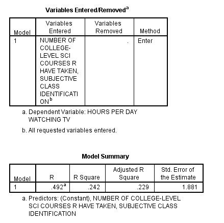
The third table, Variables Entered/Removed, tells which variables are being used in the procedure. The fourth table, Model Summary, displays the R (the Multiple Correlation value representing the correlation between the actual scores of the dependent variable and the scores for the dependent variable predicted by the regression equation), the R squared (the Multiple Squared Correlation value that if multiplied by 100 can be interpreted as a percentage to indicate that the independent variables account for 24.4% of the variability in the scores of the dependent variable), the Adjusted R square, and the Standard Error of the Estimate.
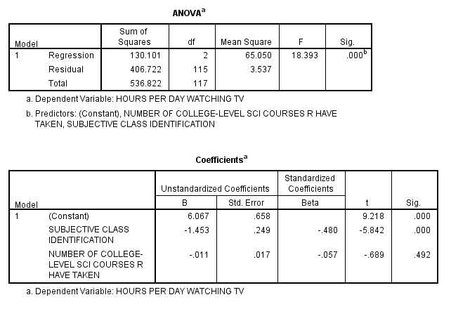
The fifth table, ANOVA, displays the Sum of Squares, df (degrees of freedom), Mean Square, F, and Sig. The sixth table, Coefficients, displays information relevant to the Least Squares Regression Line Coefficients and that can be used in the formula Y = a + bx + cz. The cell in the first row, Constant, and the first column, B, is the a value in the equation for the Least Squares Regression Line, which is the y-intercept. The cell in the first row of the second column is the standard error of the y-intercept, the average of how much the sample y-intercept differs from the population’s true y-intercept. The cells in the last two columns of the first row represent the t value and the significance, indicating whether the y-intercept is significantly different from 0.
The cell in the second row, independent variable Subjective Class Identification, and the first column, B, is the b value in the equation for the Least Squares Regression Line in original units. The cell in the second row of the second column displays the standard error of b, representing the average of how much the sample’s b value differs from the population’s true b value. The last two columns represent the t value and the significance by examining whether the b is significantly different from 0.
The cell in the third row, independent variable Number of College-Level Science Courses R Have Taken, and the first column, B, is the c value in the Least Squares Regression Line in original units. The cell in the third row of the second column displays the standard error of c, representing the average of how much the sample’s c value differs from the population’s true b value. The last two columns represent the t value and the significance by examining whether the c is significantly different from 0.
In this example, the equation of the Least Squares Regression Line is: [Hours Per Day Watching TV = 6.067 - 1.453 * (Subjective Class Identification) - .011 * (Number of College-Level Science Courses R Have Taken)].
The cells in the third column of the chart, Standard Coefficients, reports the Standard Regression Coefficient, which can also be referred to as Beta. These values are the standardized values after scores from both the dependent and independent variables have been converted to standard Z-scores. These values are also the same as Pearson’s ‘r’ Statistic and are telling of the strength and direction of the linear relationship.
Previous: Hypothesis Testing